Kitchen Wallpaper Ideas: What Works, What Doesn't, and 10 Looks Worth Trying
Kitchens present the same question as bathrooms: can wallpaper survive here? The answer depends on where in the kitchen and what type of paper. Here is how to get it right — and ten ideas that genuinely work.
The kitchen is the room people most often exclude from wallpaper plans without really thinking it through. The logic is: there is steam, there is grease, therefore wallpaper will not survive. This is partly true and mostly not. Whether wallpaper works in a kitchen depends almost entirely on two variables — where in the kitchen you are putting it and what type of paper you choose — neither of which points to blanket exclusion.
A well-chosen, correctly hung kitchen wallpaper on the right wall will outlast most kitchen refits. The mistake is not choosing wallpaper for a kitchen; it is choosing the wrong paper type or the wrong wall position.
Where wallpaper works in a kitchen
Not every wall in a kitchen is equal. Think of the kitchen in three zones:
- The cooking wall — behind the hob and oven. High heat, grease vapour, and direct steam. No wallpaper of any type. This wall should be tiled, splashback glass, or a purpose-made panel.
- The preparation and appliance walls — adjacent to the cooking zone, near the kettle and toaster, above the worktop. Moderate grease and steam. Vinyl-coated or solid vinyl papers with a washable rating work here, but require more maintenance than in a low-risk position.
- The dining and display zone — the wall at the kitchen table, the wall facing the cooking area, a breakfast bar partition, or the wall at the far end of a kitchen-diner. Minimal direct steam or grease. This zone accepts most paper types that would work in a hallway or living room.
In most kitchen layouts, the best wallpaper wall is the one you look at when seated at the table or standing at the island — typically the wall opposite or perpendicular to the hob. This position is low risk and high impact.
Pro tip: In open-plan kitchen-diners, treat the dining area as a separate room for wallpaper purposes. The living-dining side of the space has no more moisture or grease exposure than a hallway, and can be papered with the same freedom.
10 kitchen wallpaper ideas
1. Vintage botanical in a kitchen-diner
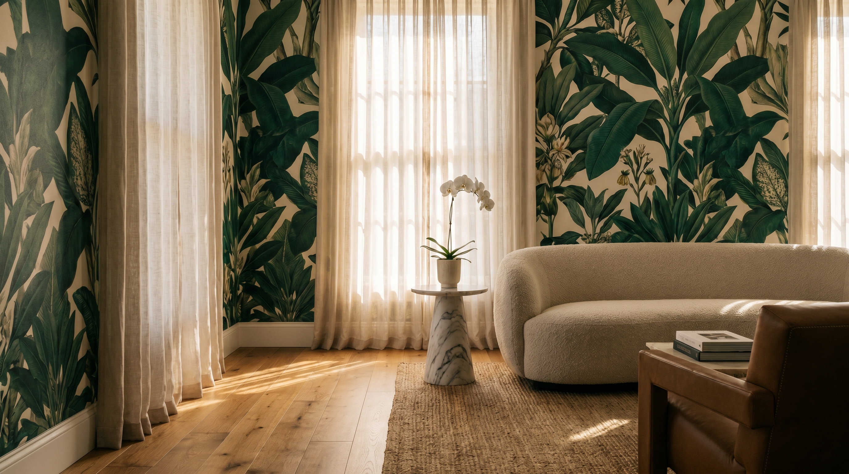
The wall at the dining end of a kitchen-diner is the most natural kitchen feature wall and one of the strongest positions for a botanical paper in any room. You look at it during every meal; it is far from the hob; and the contrast between the functional kitchen zone (usually cabinetry, tile, worktop) and a richly patterned dining wall gives the whole space a sense of deliberate design rather than accumulated functionality.
A dark botanical — forest green, deep teal — works particularly well opposite a light-coloured kitchen. The visual weight of the paper anchors the dining end and makes the two zones feel like a composed whole rather than two rooms that happen to be adjacent.
2. Maximalist print in an open-plan kitchen
Large open-plan kitchen-living spaces often have one wall that is neither kitchen nor living room — an end wall, a chimney breast that runs through the space, a wall beside the staircase. This is the position for a bold, large-scale print that reads across the whole open floor plan. The scale of the space accommodates a more emphatic pattern than a closed room would, and a strong paper on one wall of a large open plan gives the space a centre of gravity it would otherwise lack.
3. Geometric above a breakfast bar
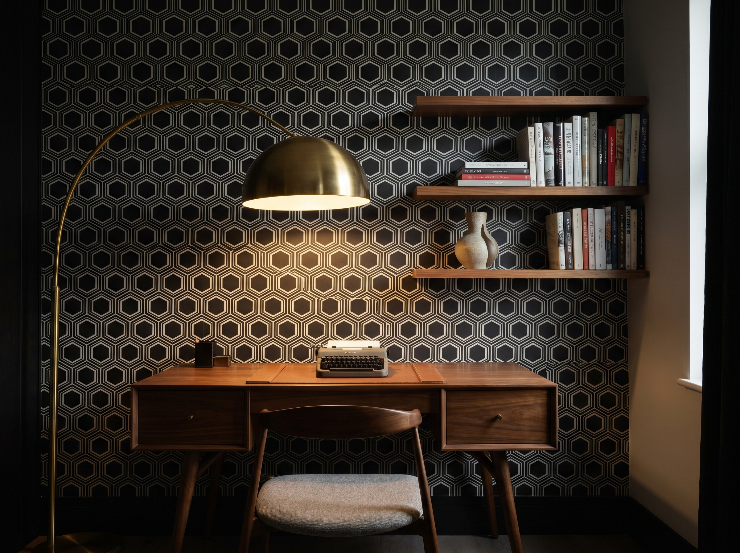
A breakfast bar or kitchen island typically creates a defined zone within the kitchen — half cooking, half dining. The wall behind the seating side of the bar is in the low-risk zone and sees constant use at close range. A bold geometric here — particularly one with a slightly three-dimensional quality, a metallic accent, or a tonal depth — creates the visual interest that makes a breakfast bar feel like a designed space rather than a practical addition.
4. Heritage tile print as a splashback alternative
Several manufacturers produce papers printed with heritage tile designs — Victorian encaustic patterns, Moroccan zellige, Art Deco geometric mosaics — at a fraction of the cost of real tile. Applied to the dining or display zone walls (not the wet splashback position), these papers create a period-appropriate or globally-inspired kitchen atmosphere. In a low-risk wall position with a vinyl-coated paper, this is a convincing and cost-effective alternative to an expensive tiled feature wall.
Note: this approach works on the display walls only. The actual splashback behind the hob must remain tile, glass, or a purpose-made panel — no paper, however moisture-resistant, should be used directly behind a hob.
5. Panelling or tongue-and-groove effect below the dado
A wallpaper that simulates tongue-and-groove boarding or raised panel woodwork, applied below the dado rail in a kitchen, creates a country kitchen or farmhouse effect that is significantly cheaper and faster to install than actual joinery. Above the dado, either a complementary paper or a paint in a colour drawn from the paper below. The dado-height divide is also practically useful in kitchens: the painted wall above can be wiped down without concern; the paper below (which is in any case less exposed to cooking vapour) stays decorative.
6. Vertical stripe in a galley kitchen
A galley kitchen — narrow, with runs of units on both sides — is one of the most confined kitchen configurations. Vertical stripe wallpaper on the end wall (the wall you see at the end of the corridor) draws the eye toward it and makes the galley feel longer and taller simultaneously. A tone-on-tone stripe in a deep colour turns what is often a utilitarian space into something intentional. This is one of the few kitchen positions where all four surrounding surfaces are typically tile or cabinetry, making the one wallpapered end wall a genuine focal point.
7. Country floral in a traditional kitchen
A large-scale vintage floral — painted roses, cabbage blooms, rambling garden plants — on the dining wall of a traditional or shaker-style kitchen is a combination that has worked for a century and shows no signs of stopping. The informality of the floral suits the working character of a kitchen better than a more precise or graphic design. The best versions are loose and slightly faded in palette — the kind of paper that looks as if it has been there for twenty years and would be wrong to replace.
8. Toile de Jouy in a classic kitchen
Toile in a kitchen is a French country house tradition — particularly the red-on-cream colourway, which has appeared in every provincial kitchen from Lyon to Burgundy for two hundred years. It works because the pastoral narrative of toile (shepherds, harvest scenes, classical figures in landscape) references exactly the agrarian, food-producing world that a kitchen inhabits. Applied to the dining wall or as an all-four-walls treatment in a small kitchen-diner, it creates an atmosphere that is warm, specific, and entirely timeless.
9. Modern graphic in a handleless kitchen
A contemporary handleless kitchen — flat-front cabinetry, integrated appliances, stone worktop — is typically a precise, restrained space. A bold modern graphic on the dining wall (abstract, geometric, or a strong colour-field print) creates the contrast that gives the kitchen personality without disrupting the clean lines of the cabinetry. The kitchen provides the discipline; the paper provides the character. Neither element works as well without the other.
10. Peel-and-stick in a rental kitchen
Rental kitchens are typically among the bleakest rooms in any property — magnolia walls, white goods, institutional cabinetry. Premium peel-and-stick paper on the dining wall, or on the wall visible from the main living space, transforms this without any risk to the deposit. Choose a paper in the low-risk zone away from the hob, ensure the wall is clean and well-cured, and hang as you would in any other room. Removal is clean, and the next tenant will never know.
Paper types for kitchens
| Paper type | Kitchen suitability | Best position |
|---|---|---|
| Standard paste paper (untreated) | Low-risk zones only, good ventilation | Dining wall in kitchen-diner, far from hob |
| Vinyl-coated paste paper | Low-risk and moderate zones | Best all-round kitchen choice; wipeable |
| Solid vinyl / commercial vinyl | Moderate and high-risk zones | Nearest wall to cooking area if required |
| Paste-the-wall (non-woven) | Low-risk zones | Good dimensional stability; easier to hang around cabinets |
| Peel-and-stick | Low-risk zones, good ventilation | Rental kitchens; dining wall in kitchen-diners |
| Genuine grasscloth | Not recommended | Absorbs grease vapour; not washable |
| Embossed / textured paper | Low-risk zones only | Grease accumulates in the texture — avoid near cooking |
Preparing a kitchen for wallpaper
- 1.Degrease before sizing. Kitchen walls accumulate a film of cooking grease that prevents adhesive from bonding properly. Wash the wall thoroughly with a sugar soap solution and allow to dry completely before applying size.
- 2.Check ventilation. An extractor hood that vents to the outside (not recirculating) is the most important variable for kitchen wallpaper longevity. If your extractor only recirculates, grease vapour builds up on wall surfaces regardless of paper type.
- 3.Apply a coat of size appropriate to the paper type. Non-woven papers benefit from a paste-the-wall size that slightly extends the open time — useful around kitchen cabinets where accurate positioning matters.
- 4.Seal all edges carefully. Run a bead of clear silicone caulk where the paper meets worktop upstands, tile edges, or cabinet surrounds. This prevents moisture and grease from wicking behind the paper from the bottom edge.
- 5.Use a fungicidal paste in the area nearest the sink and dishwasher. These appliances generate more moisture than the hob, and fungicidal paste prevents mould forming at the wall-paper junction over time.
How many rolls for a kitchen?
Kitchens have more obstacles per square metre than any room — cabinets, doors, windows. Use our calculator for a precise roll count including waste.
Frequently asked questions
James Whitfield
James is a former interior decorator turned writer, based in Edinburgh. He has hung wallpaper in over 200 homes and writes about craft, materials, and getting things right first time.
Continue reading
Never miss a story