Wallpaper for Dark Rooms: What Actually Works (and What Makes It Worse)
The standard advice for dark rooms — go pale, go light, avoid pattern — is wrong more often than it is right. Here is what actually works in north-facing, low-light, and basement rooms, and why leaning into the darkness frequently produces a better result than fighting it.
The advice most people receive about dark rooms is: go pale. White walls, light colours, nothing that will absorb what little natural light there is. It is given confidently and followed widely. It is also wrong most of the time.
Pale walls in a dark room do not create the impression of brightness. They create the impression of an unlit pale room — which is duller than a deliberately dark room and more depressing than either. The real problem with north-facing and low-light rooms is not darkness itself but the quality of the light: cool, flat, and bluish. The solution is not to add more of that light but to counteract its quality — with warmth, texture, and in many cases, deliberate darkness used well.
Why pale wallpaper fails in dark rooms
Natural light in a north-facing room has a colour temperature of approximately 6000–7000K — significantly cooler and bluer than direct sunlight (around 4000–5000K in the UK) or warm artificial light (2700–3000K). This cool light makes whites look cold and clinical, pale blues look grey and flat, and pale greys look lifeless.
A white or pale paper in a north-facing room emphasises exactly the quality that makes the room feel bad: it bounces the cool blue light back at you and provides no warmth of its own. A warm-toned dark paper absorbs the cool light, contributes warmth from its own pigment, and creates an atmosphere that reads as intentional rather than defeated. The room does not become brighter, but it stops feeling dim — which is not the same thing.
Pro tip: The test for any wallpaper in a dark room: hold the sample up and view it only under the room's actual light at the time of day you use the room most. Not in a showroom, not on a screen, not in the morning of a west-facing room. The specific light of the specific room at the specific time is the only relevant test.
The two approaches that work
Approach 1: lean into the darkness
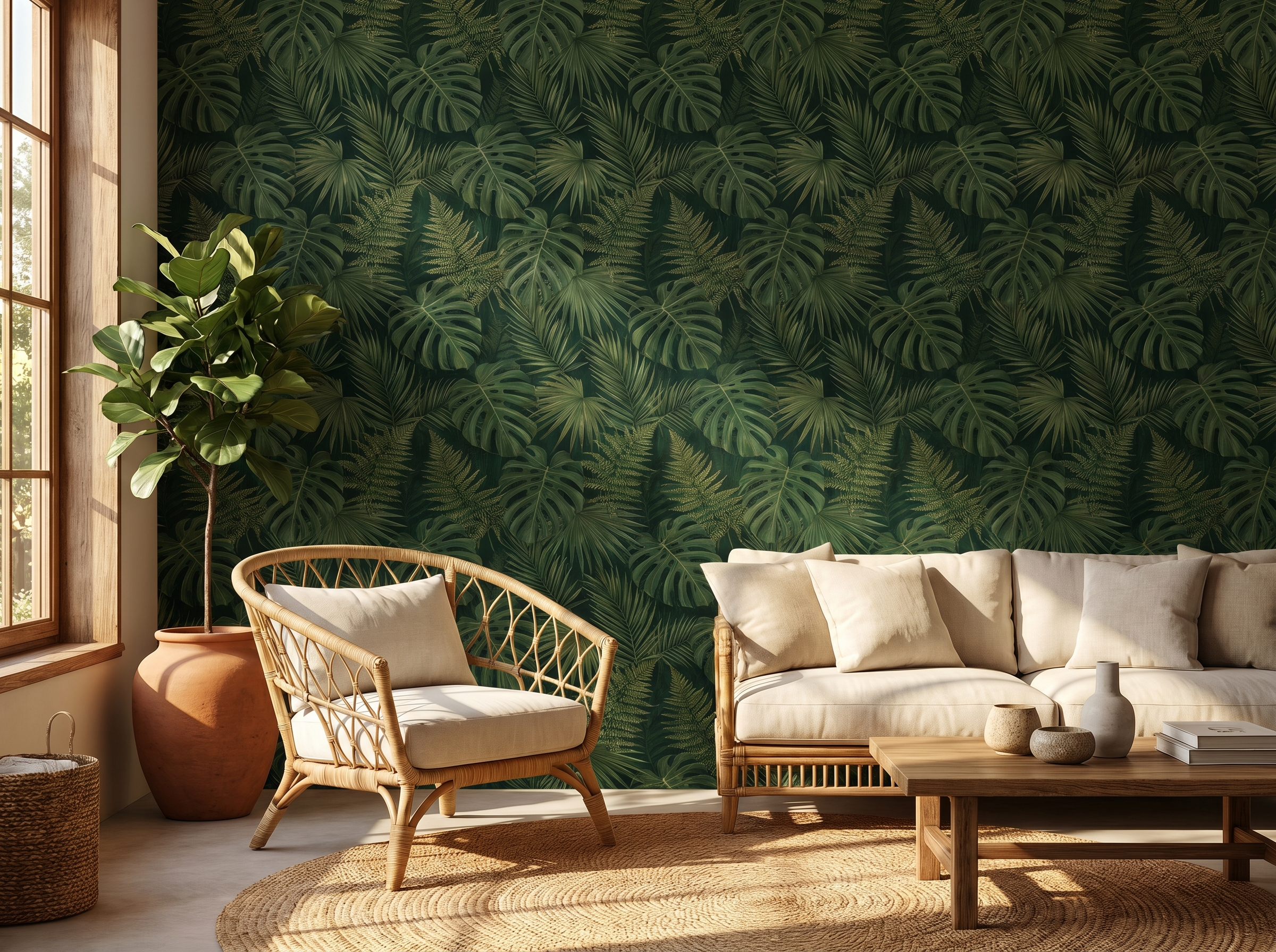
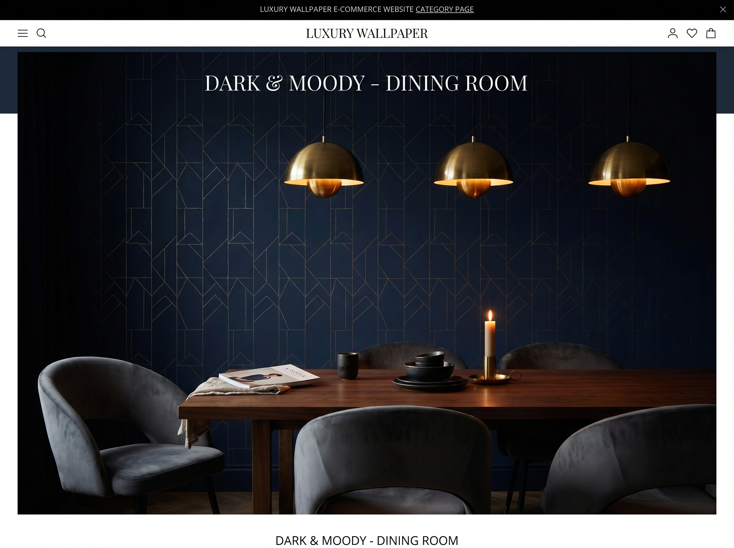
The jewel-box approach accepts that the room is dark and works with that quality rather than against it. A deep, richly patterned paper — dark botanical, dense chinoiserie, warm burgundy damask — combined with warm artificial lighting (2700K bulbs, plenty of them) creates a room that feels deliberate, intimate, and atmospheric. The darkness becomes an asset rather than a problem. Evening is when the room looks best.
This approach works best in rooms used primarily in the evening or under artificial light: dining rooms, snugs, home cinemas, dark hallways, and bedrooms. It fails in rooms that need to function as well-lit work or cooking spaces during the day.
Approach 2: add warmth, not lightness
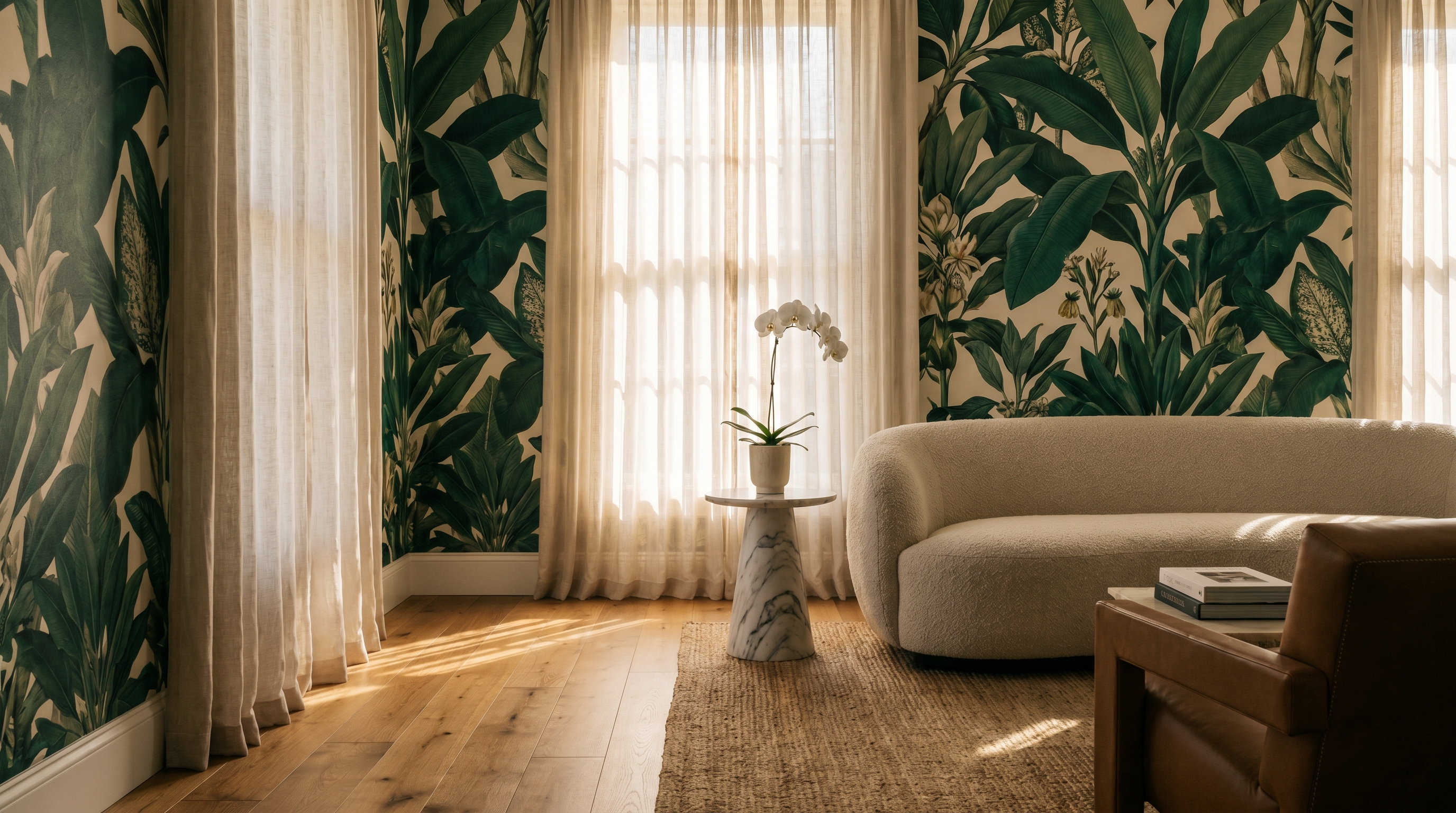
The second approach does not embrace darkness but counteracts the quality of the light rather than its quantity. Warm-toned papers in mid-range depths — warm terracotta, amber, soft forest green with warm undertones, deep cream with golden pigment — absorb the cool blue cast of north-facing light and contribute warmth from their own colour. The room does not become brighter in absolute terms, but it stops feeling cold, which is the more important problem to solve.
This approach works in rooms used primarily in daylight: living rooms, studies, kitchens, and children's rooms in north-facing positions. The warm tone compensates for the cool light without making the room feel like a deliberate evening space.
Wallpaper types that work in dark rooms
| Type | Why it works | Best for |
|---|---|---|
| Warm botanical (forest green, deep teal) | Warm undertones compensate for cool north light; complexity rewards time spent in the room | Living rooms, bedrooms, dining rooms |
| Terracotta / amber / warm rust tones | Strong warm undertones directly counteract the blue cast of north-facing light | Living rooms, kitchens, studies |
| Metallic or silk-effect papers | Reflective surface bounces available light around the room, creating movement | Hallways, dining rooms, feature walls |
| Grasscloth in warm colourways | Natural texture diffuses light and adds warmth without a visible pattern | All rooms — especially understated spaces |
| Warm-ground chinoiserie | Cream or buff ground avoids cold whites; intricate pattern creates visual warmth | Dining rooms, living rooms, bedrooms |
| Deep jewel tones (burgundy, plum, hunter green) | Jewel-box effect makes the darkness intentional and atmospheric | Dining rooms, snugs, bedrooms |
| Abstract painterly with warm palette | Movement and warmth without a loud pattern statement | Living rooms, bedrooms, studies |
Wallpaper types that make dark rooms worse
- Cool white or bright white backgrounds. These reflect the blue cast of north light back into the room and make it feel colder and flatter. If you want a pale paper, choose one with a warm undertone: cream, off-white with a yellow or pink cast, warm stone.
- Cool grey tones. Mid-century grey papers were designed for south-facing rooms with warm direct sunlight. In a north-facing room, grey reads as the absence of colour — flat, institutional, defeated.
- Pale blue or cool lavender. Blue already has a cold association. In north-facing light, pale blue papers make rooms feel like they are perpetually overcast. The colour and the light quality reinforce each other in the worst possible way.
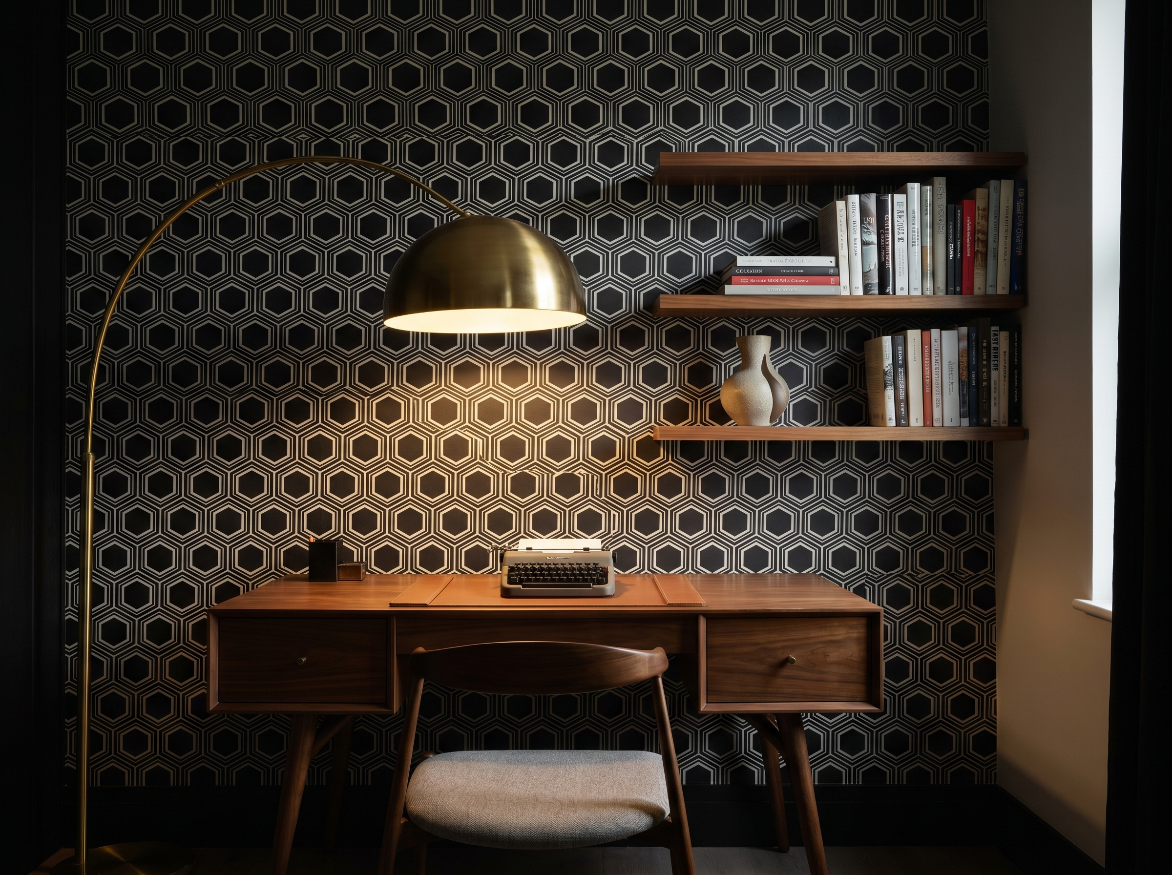
- High-contrast black-and-white geometric. The stark contrast reads as harsh in flat diffuse north light, which strips out the shadows and highlights that make geometric patterns dynamic. The result is a room that feels simultaneously busy and flat.
- Cold-toned metallics (silver, chrome-finish). Warm gold metallics work in dark rooms; cool silver metallics amplify the blue quality of north light. Check the metallic's underlying tone before ordering.
Room by room: specific recommendations
North-facing living room
The north-facing living room is the most common dark room problem in UK houses. The temptation is to keep it pale and supplement with lamps. The better result is almost always a warm mid-depth paper — a warm forest green botanical, a terracotta-ground geometric, a warm amber grasscloth — combined with plenty of warm artificial light. This approach transforms the room's character from 'unfortunate orientation' to 'cosy and considered'.
Avoid bright white and cool grey. They do not make north-facing rooms feel bright; they make them feel cold. The room will always look better with warm colour and warm light than with pale walls and fluorescent-adjacent overhead lighting.
North-facing bedroom
A north-facing bedroom actually benefits from its orientation in one specific way: it does not get the early morning sun that wakes light sleepers in east-facing rooms. For wallpaper, the same warm-tone rule applies, but the bedroom's lower light requirement (you are not reading under natural light in the way you might in a living room) makes the jewel-box approach particularly viable. A dark botanical or a deep warm-ground chinoiserie on the head wall reads as deliberately romantic rather than unintentionally gloomy.
Dark hallway (no windows)
A windowless or very dark hallway is entirely reliant on artificial light. This means the cool-light problem disappears — you control the colour temperature entirely by choosing warm bulbs. In this context, the jewel-box approach is almost always correct: a dark, rich, complex paper on all four walls, lit by warm-toned wall lights or pendants. The hallway becomes a dramatic transition space rather than a poorly-lit corridor. The absence of natural light, rather than being a problem, becomes the condition that makes the most theatrical wallpaper choices work.
Basement and below-ground rooms
Below-ground rooms share the hallway's characteristic: natural light, where it exists at all, comes from a single direction at a very low angle (through pavement lights or a lightwell), and is always partial. Again, warm artificial light is the primary source. The jewel-box approach works extremely well — basement rooms with dark, enveloping papers are some of the most successful rooms that architects and decorators produce. The confinement that makes pale treatments feel oppressive makes dark treatments feel cocooning.
The one caveat for basement rooms: check for and resolve any dampness before papering. Below-ground rooms that have ground moisture issues will cause any wallpaper to fail, regardless of type. A tanking treatment or a dehumidifier installed before papering prevents a significant amount of future grief.
Colour and light alongside the right wallpaper
Wallpaper cannot solve a dark room alone. The lighting strategy matters as much as the paper choice. In a dark room with the right paper:
- Use 2700K bulbs exclusively — warm white, not cool white or daylight-spectrum. This single change transforms how warm-toned papers read.
- Layer light sources: ceiling pendant plus table lamps plus floor lamp, rather than a single overhead source. Multiple warm light sources eliminate the flat, shadowless quality of overhead-only lighting.
- Use uplighters behind furniture to throw light onto the wall and ceiling. This reveals the paper's texture and depth in a way that direct overhead light does not.
- Keep the ceiling light and neutral — white or warm white. Papering or painting the ceiling dark in a room that already lacks light adds to the problem rather than the jewel-box effect.
- Use mirrors deliberately, not habitually. A mirror on the wall opposite the main light source doubles the effective brightness. Mirrors facing walls rather than light sources do nothing useful.
Find the right paper for your room
Browse our curated wallpaper edit, filterable by colour family — so you can find warm-toned papers without scrolling through every cool-ground design in the catalogue.
Browse wallpapers →Frequently asked questions
Sofia Laurent
Sofia is a Paris-based interiors writer and contributing editor at Murall Journal. She covers trend, design culture, and the spaces that shape us.
Never miss a story