Bedroom Wallpaper Ideas: 10 Designer-Approved Looks for Every Style
The bedroom rewards bolder choices than almost any other room — you're looking at it last thing at night and first thing in the morning. Here are ten wallpaper directions that consistently deliver in the space that matters most.
The bedroom is the room most people are most cautious about, and it is the room where caution most consistently produces the wrong result. The logic runs something like: this is where I sleep, so it should be calm; calm means pale; pale means safe. But the bedroom is also the room you experience in the most intimate, sustained way — lying in bed, at close range, for hours at a time. A wallpaper that rewards extended attention matters here more than anywhere.
The other thing the bedroom has that most rooms do not: an obvious, natural feature wall. The wall behind the bed is one of the strongest architectural statements available in a domestic interior. You can treat it as a headboard at scale — and a confidently chosen wallpaper does exactly that.
Feature wall or full room?
For bedrooms, a single feature wall behind the bed is almost always the right call for a first or second wallpaper project. The scale is forgiving: even a bold, dense pattern works on a single wall because the painted walls on either side provide breathing room. Full-room papering in a bedroom works beautifully but asks more of the design — you need a pattern with enough internal variation that it reads as an environment rather than a repeated motif at close range from the pillow.
If you want to paper all four walls, choose a design with a pale or neutral background, a relatively open composition, or a tonal/textural quality that feels enveloping rather than busy. Dense repeat patterns on four walls in a bedroom can make the room feel smaller and are harder to relax in. Dark-background designs can work on four walls if the room has strong natural light — they create a cocooning effect that many people find ideal for sleep.
10 bedroom wallpaper ideas
1. Dark botanical behind the bed
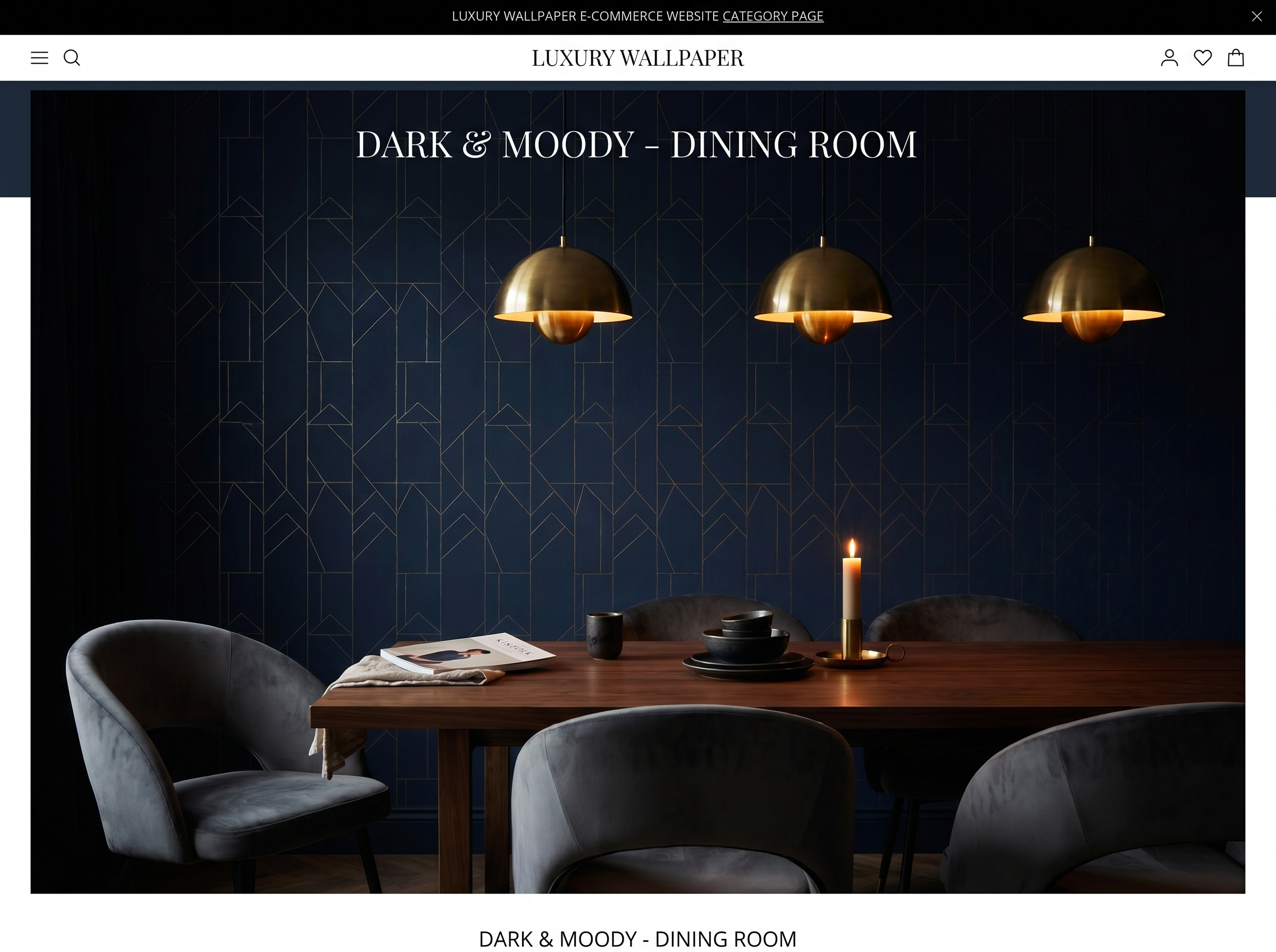
A deep-background botanical — forest green, inky blue, near-black — on the wall behind the bed is the contemporary bedroom statement that has held its ground for three years running. It works because it does precisely what a bed head wall should: it creates a visual anchor for the bed, makes the white or neutral bedlinen pop against it, and turns the bedroom into a room you want to be in rather than merely sleep in.
Choose a design with enough detail — layered leaves, depth, multiple tonal greens or blues — that there is always something to notice. A flat dark botanical with a obvious repeat gets dull quickly at close range. The best options feel almost illustrative, with hand-drawn linework and botanical accuracy.
2. Soft chinoiserie
Chinoiserie at pale scale — pale blue or cream ground, delicate painted birds, blossoming branches, wandering figures — is one of the most enduring bedroom papers because it is simultaneously calm and visually rich. There is always something to look at without the paper ever demanding attention. The traditional colourways (soft blue-grey, warm ivory, blush-touched cream) are also naturally suited to bedrooms because they sit at the cool-warm boundary that reads as restful under lamplight.
Use it on all four walls for a period-appropriate treatment, or on the head wall alone against a warm white. Either approach works; the full-room version rewards rooms with high ceilings and traditional architraves.
3. Textured grasscloth
Grasscloth — woven natural fibres bonded to a paper backing — is the most tactile wallpaper available and one of the most flattering in a bedroom. The texture catches the warm light of bedside lamps and reads differently by day and by night: flatter and more neutral in daylight, warm and dimensional under evening lamps. It is also one of the most forgiving choices from a design perspective — it works with almost any furniture style because it reads as a material rather than a pattern.
Use it on all four walls in a bedroom without hesitation. The texture is quiet enough that full-room treatment does not overwhelm, and the warmth it adds to a room with even a modest amount of lamplight is dramatic.
4. Pale maximalist floral
Large-scale vintage florals on a pale or white background — the kind with roses or peonies drawn at near life-size — have migrated firmly from traditional to contemporary contexts. The key quality is confidence of drawing: an oversized, boldly rendered floral does not read as fussy. It reads as graphic, even at the scale of a bedroom wall.
Pair with plain linen bedding in one of the floral's secondary colours — a dusty pink, a warm sage — and avoid adding any further pattern. The floral is the room's single printed element; everything else should be solid, textured, or natural material.
5. Geometric headboard wall
A bold geometric — particularly one with a strong vertical or diamond emphasis — behind the bed creates the graphic equivalent of a headboard. It defines the bed's position in the room and gives the whole arrangement a deliberate, composed quality that feels considered rather than assembled. This approach works especially well in rooms where the bed does not have a physical headboard: the wallpaper becomes the headboard.
Choose a geometric with some depth — metallic ink, tonal variation within the pattern, or a subtle embossed texture — rather than a flat two-colour print. The depth rewards the close-range viewing that the bedroom demands.
6. Moody landscape mural
A single-wall landscape mural — a misty forest, a mountain panorama, a twilight pastoral scene — behind the bed turns the bedroom into something closer to an installation than an interior. The effect is immersive in a way that no repeat pattern can achieve, because the eye reads a mural as continuous space rather than a decorated surface.
The practical consideration: murals are printed to your exact wall dimensions and arrive as numbered panels (typically 6–12 for a bedroom head wall). Installation is methodical but straightforward — the panels are hung in sequence and the print bleeds slightly at each join to ensure the join disappears. Most manufacturers supply detailed hanging instructions specific to the print.
7. Vertical stripe for borrowed height
A vertical stripe in a deep colour on the head wall does two things simultaneously: it creates a graphic statement that anchors the bed, and it makes the ceiling appear higher. The eye follows the stripe upward and the room's vertical dimension is exaggerated as a result. This is one of the most effective tricks available in rooms with low or average ceiling heights.
Match the darker stripe tone to the skirting board and the lighter stripe to the ceiling. This grounds the stripe visually and makes the whole wall treatment feel resolved rather than applied. Avoid stripes with a strong contrast between stripe and background — the effect becomes too graphic for extended bedroom use. Tone-on-tone stripes (forest green on dark green, navy on blue) wear better.
8. Toile de Jouy
Toile de Jouy — the French pastoral print of romantic scenes, shepherdesses, and classical landscapes in a single colour on cream or white — has outlasted every trend cycle it has been declared unfashionable by. Its durability comes from the same quality that makes it work in bedrooms: the scenes reward close attention without ever demanding it. You can look at a toile wall for an hour and keep finding things you had not previously noticed.
Use it on all four walls or on the head wall alone. Traditional colourways (classic red-on-cream, blue-on-white) are correct; contemporary versions in olive, charcoal, or black-on-white are equally valid and work in rooms where the traditional colourways would feel too period-specific.
9. Abstract watercolour wash
Loose, gestural watercolour papers — clouds of colour that bleed and pool across the surface in a way that suggests paint rather than print — are among the most relaxing bedroom choices because the abstraction prevents the eye from ever fully resolving the pattern. There is no repeat to find, no motif to locate. The eye reads it as colour and movement rather than design, which produces a quieter, more restful visual experience than any repeat pattern can.
Choose a colourway with enough tonal range to prevent it from reading as flat paint — a watercolour wash that moves from deep to pale across its surface, or one that incorporates two or three colour families, is more interesting in close-quarters bedroom use than a single uniform tone.
10. The renter's bedroom transformation
Premium peel-and-stick wallpaper has made the bedroom feature wall available to renters in a way it genuinely was not five years ago. The adhesive quality of the best brands (Chasing Paper, Tempaper, Hygge & West) is now sufficient for a full bed-head wall that looks and behaves like traditional paste paper and removes cleanly when you move out.
The only constraint worth observing: avoid applying peel-and-stick to walls with very fresh paint (under 30 days) or any paint that is already peeling. Both conditions mean the wall surface is weaker than the adhesive, and removal may lift paint. On a sound, well-cured painted wall, a premium peel-and-stick installation is the most practical bedroom upgrade available on a rental budget.
Shop bedroom wallpaper
Browse our edit of bedroom-specific designs — from dark botanicals to pale chinoiserie, curated for the head wall and beyond.
Explore bedroom designs →Choosing for your bedroom: three specific considerations
Colour temperature and sleep
Cool colours (blue-greys, cool whites, lavender) are widely understood to support sleep. Warm colours (terracotta, amber, warm greens) are more stimulating but more flattering under lamplight. In practice, the lamp temperature in your bedroom matters more than the wallpaper colour — a warm bulb (2700K) makes almost any colour read warmer and cosier. The more important wallpaper variable for sleep quality is busy-ness: a highly complex, high-contrast repeat pattern is more visually stimulating than a tonal or abstract one, regardless of colour.
Pattern scale in relation to room size
In smaller bedrooms, the instinct is to choose a small pattern. This is frequently wrong. A small, busy repeat on four walls in a small bedroom creates visual noise that makes the room feel more cramped, not less. A confident, oversized pattern on a single wall — with the three remaining walls plain — often reads better because it gives the eye a clear subject and does not multiply the repeat across multiple surfaces.
Morning light vs. evening light
East-facing bedrooms receive morning sun, which is relatively cool and blue. West-facing rooms receive afternoon and evening light, which is warm and orange. South-facing rooms get consistent bright light throughout the day. North-facing rooms get no direct sun and rely on ambient daylight and lamps. Check which direction your bedroom faces and view samples in that light at the time of day you use the room most.
Frequently asked questions
Sofia Laurent
Sofia is a Paris-based interiors writer and contributing editor at Murall Journal. She covers trend, design culture, and the spaces that shape us.
Continue reading
18 September 2026 · 8 min read
Living Room Wallpaper Ideas: 12 Looks That Interior Designers Actually Recommend
4 June 2026 · 6 min read
How to choose wallpaper for small rooms (without making them feel smaller)
19 May 2026 · 4 min read
Why botanical wallpaper is the defining interior trend of 2026
Never miss a story