How to choose wallpaper for small rooms (without making them feel smaller)
The conventional wisdom says avoid bold patterns in small spaces. We beg to differ — here's how to use scale, colour, and placement to your advantage.
The received wisdom about small rooms and wallpaper is almost always the same: keep it light, keep it plain, don't make a statement. It's well-meaning advice, but it misses the point. A small room with a confident, well-chosen wallpaper can feel like a jewel box — intimate, considered, and more memorable than any magnolia-painted space twice its size.
The key isn't pattern size or colour intensity. It's understanding how your eye moves around a room — and giving it somewhere interesting to go.
The scale myth
Small room, small pattern. It sounds logical, but in practice, tiny repeating patterns on every wall create visual noise that makes a space feel busier and more cramped than a single bold motif. Your eye has nowhere to rest.
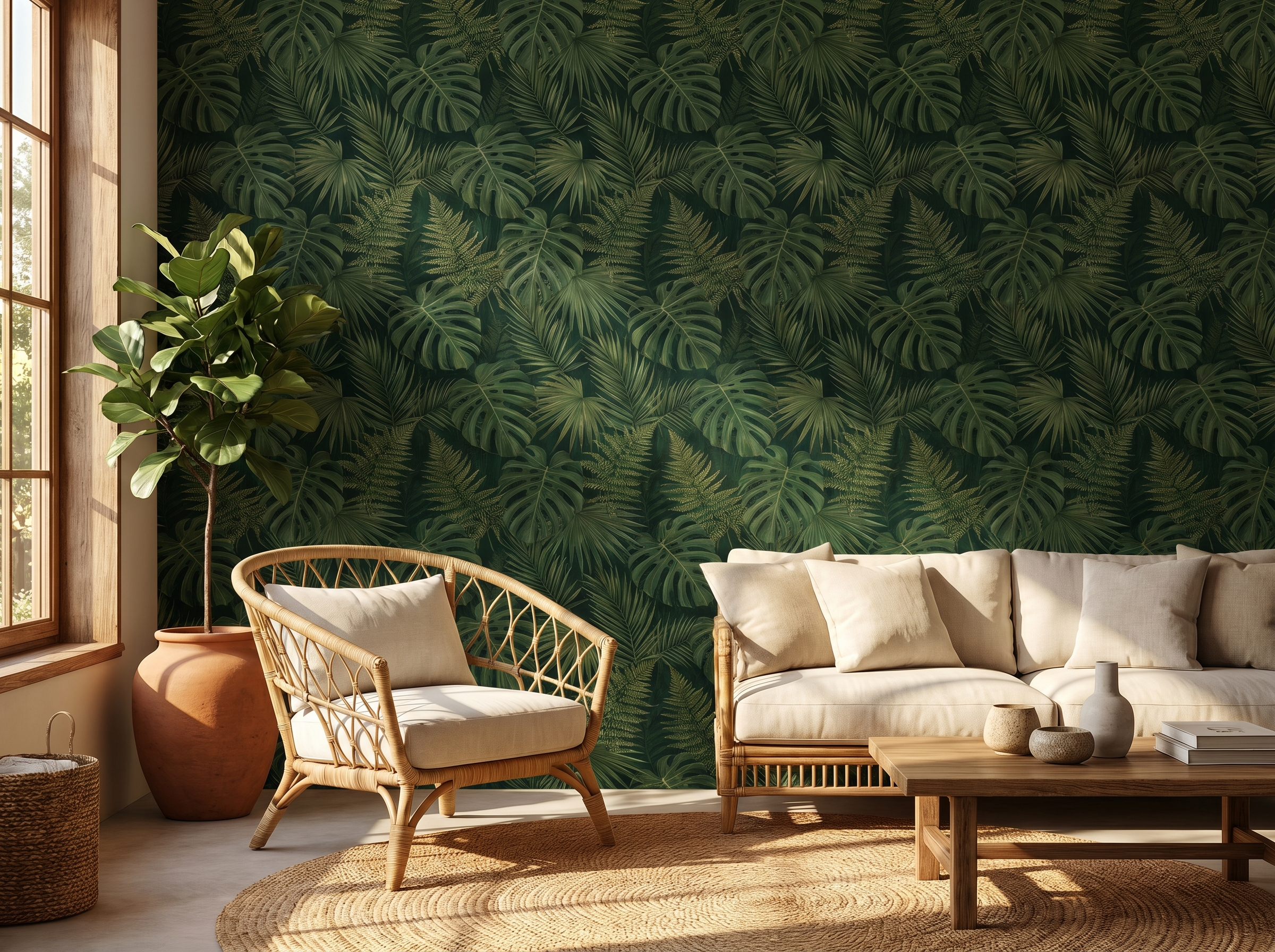
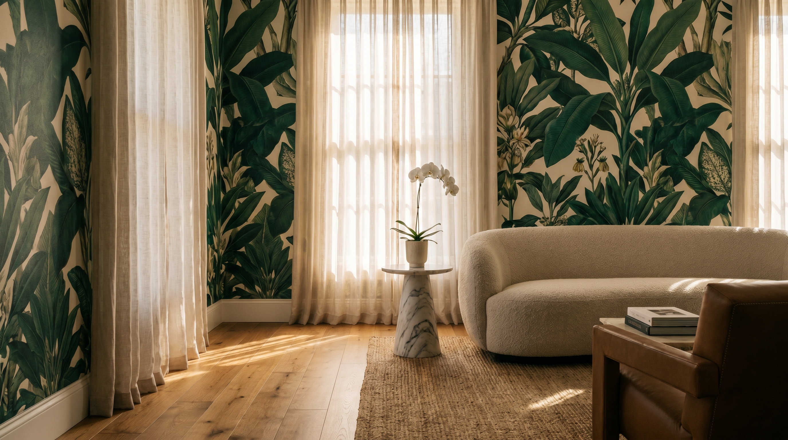
Counter-intuitively, large-scale designs — a sweeping botanical mural, an oversized geometric — can actually read as calmer in a small space because they give the eye a clear focal point. A single full-bleed leaf pattern behind a bed doesn't compete with itself; it simply is.
"A small room done well doesn't try to pretend it's larger. It leans into its scale and becomes a complete, curated world."
Vertical patterns and the height trick
Stripes are the oldest trick in the book, but they work. Vertical stripes — whether explicit or implied by a tall botanical repeat — draw the eye upward and make ceilings feel higher. Even in a 2.4m room, a wallpaper with a strong vertical movement changes the perceived proportions dramatically.
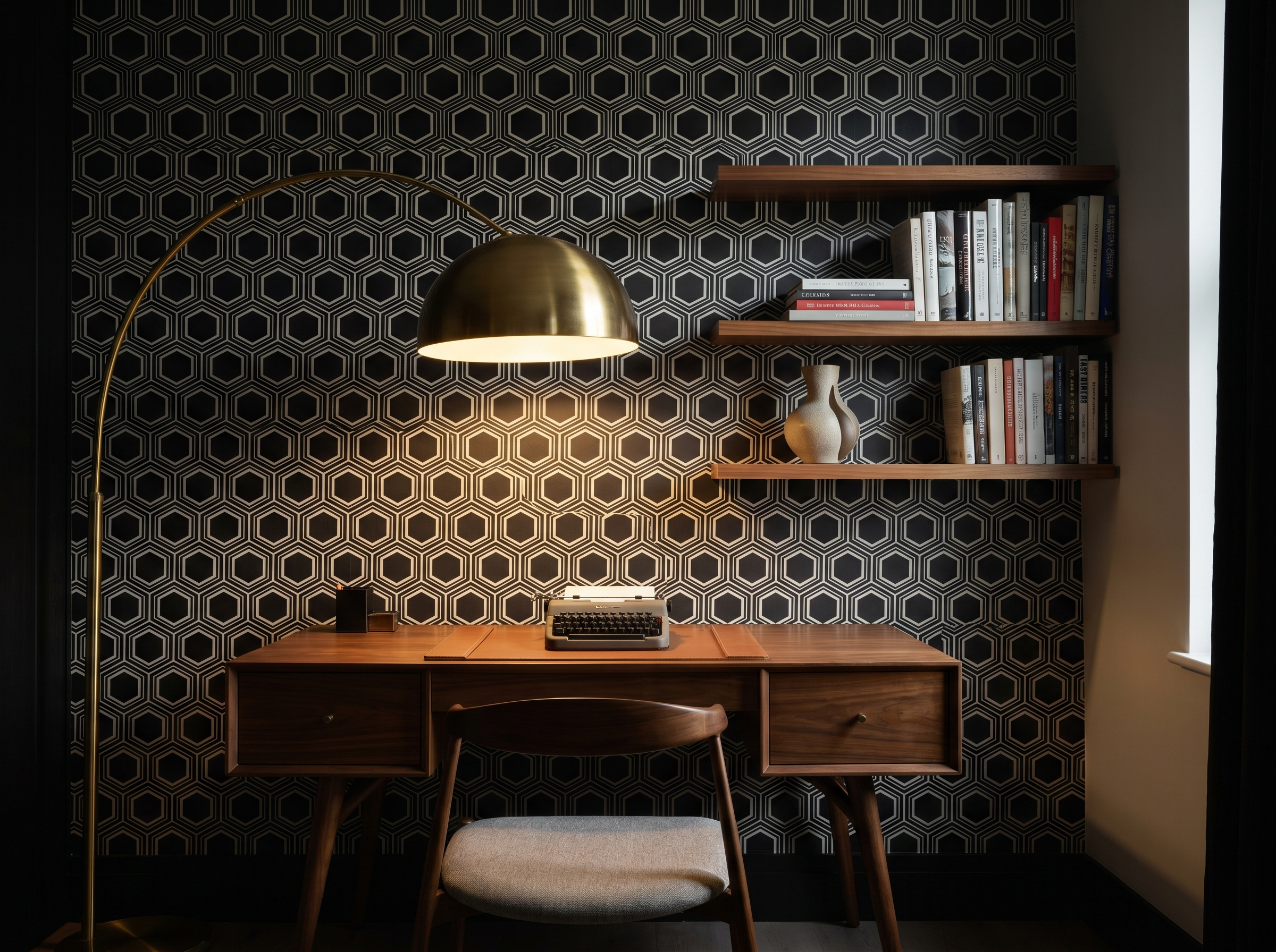
Look for designs where the dominant lines or shapes run top to bottom rather than side to side. Narrow florals on a climbing vine, classic ticking stripes, or elongated geometric columns all create this effect.
Colour and light
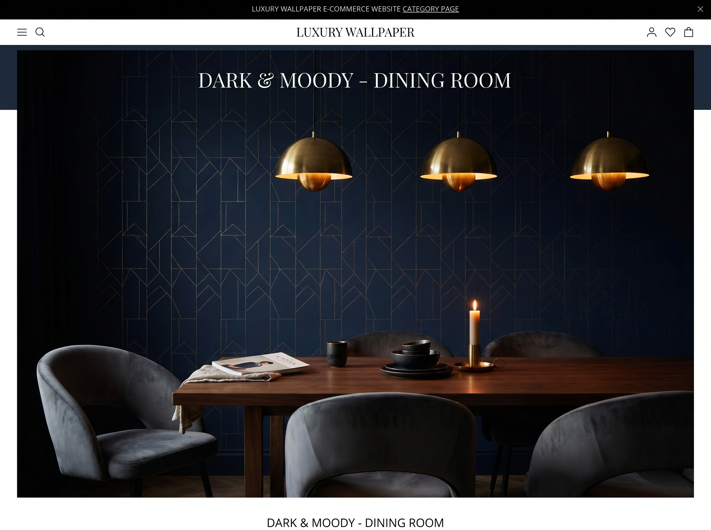
Dark wallpapers in small rooms is where most people hesitate — and where some of the best results happen. A deep, moody wallpaper on all four walls of a small dining room or powder room creates a sense of depth that actually makes the space feel larger. The eye perceives the walls as receding rather than closing in.
The critical variable is light. A dark wallpaper in a room with good natural light or well-planned artificial light glows. The same paper in a windowless box becomes oppressive. Before you rule anything out, take a sample home and observe it in the actual light conditions of the room at different times of day.
The ceiling technique
One of the most underused tricks in small spaces: wallpaper the ceiling. Bringing the same pattern up and over creates a cocoon effect that feels intentional rather than cramped. It works especially well in alcoves, under-stair spaces, and box rooms — anywhere with clearly defined limits that benefit from being acknowledged rather than fought.
If a full ceiling feels too much, try the fifth-wall approach: wallpaper down from the ceiling to a picture rail or dado height, then paint below it in the darkest shade of the pattern's background colour.
One wall or four?
The accent wall — one wallpapered surface, three painted — is popular for a reason: it's the lowest-commitment approach and it works reliably. But four walls of the same pattern can be more powerful, especially in rooms where you want to lean into their smallness.
A good rule of thumb: if the pattern is busy and multicoloured, one wall is usually safer. If the pattern is quieter — a tonal texture, a subtle geometric, a single-colour botanical — four walls create a more enveloping, considered result.
- One wall: best for bold, multicoloured, or oversized patterns
- Four walls: best for tonal, textural, or quieter repeats
- Ceiling too: works brilliantly in alcoves and under-stair spaces
- Always test a physical sample in the actual room — screens lie
The final rule
The only wallpaper that's wrong for a small room is one you chose out of fear. The hallway you've been staring at for years, the powder room nobody photographs — these are precisely the spaces that reward a little courage. Order a sample. Live with it for a week. Then commit.
Harriet Cole
Harriet is Murall's editorial director and a former contributing editor at World of Interiors. She has been writing about interior design for fifteen years.
Continue reading
Never miss a story