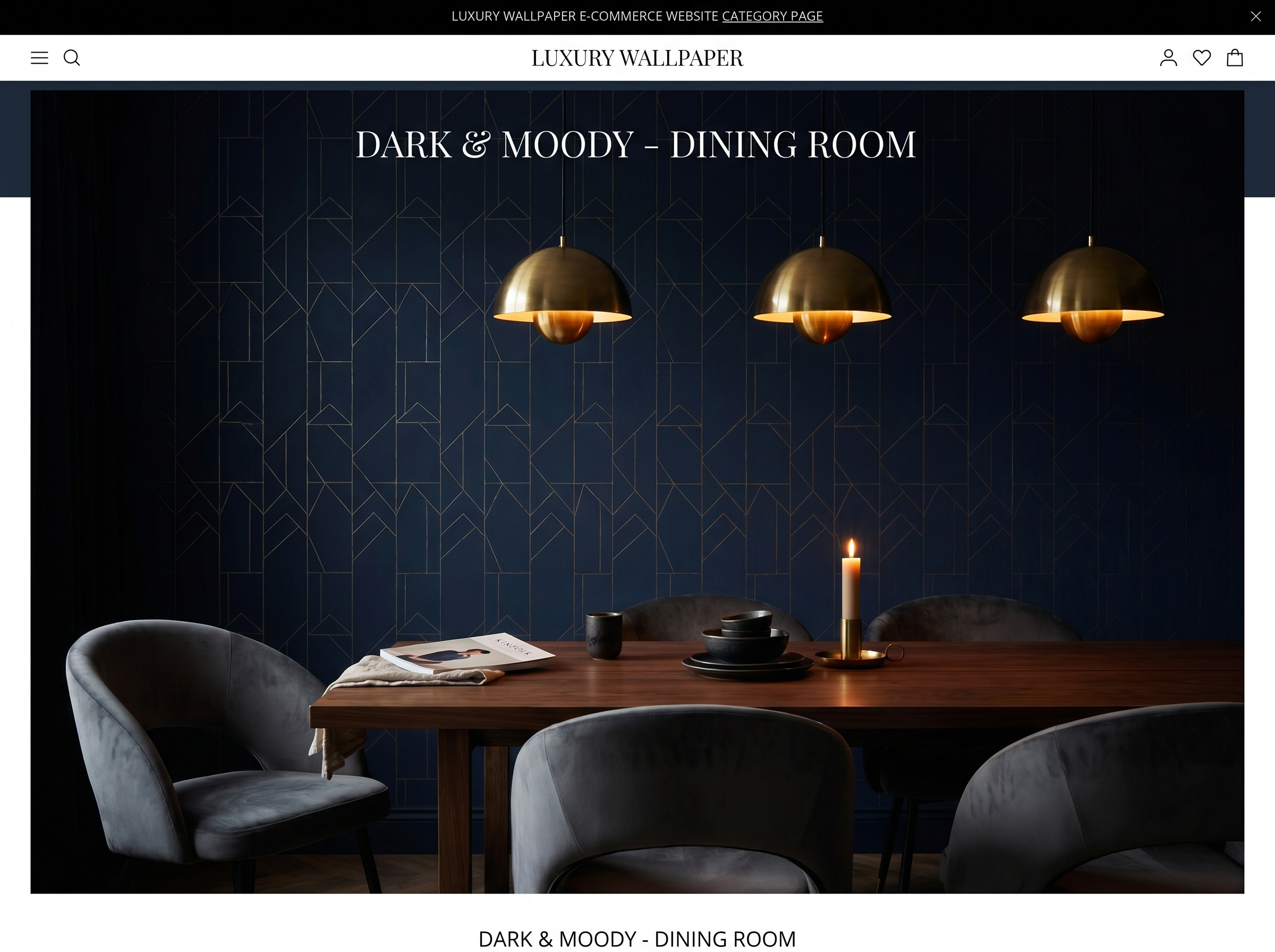
Feature Wall Ideas: How to Choose the Right Wall and Get It Right
A feature wall done well is one of the most cost-effective design decisions in a home. Done badly, it looks like an afterthought. The difference is almost always in which wall you choose and how you treat the three walls around it.
A feature wall is a single wall treated differently from the three surrounding it — most often with wallpaper, though sometimes with paint, panelling, or a combination. The idea is simple. The execution varies enormously in quality. The difference between a feature wall that transforms a room and one that looks applied and awkward is almost always in the two decisions made before the paper goes up: which wall, and what to do with the walls around it.
This guide covers both. It is not a list of pattern ideas — those are in the room-specific guides for living rooms, bedrooms, hallways, dining rooms, and bathrooms. This is the practical architecture of feature wall decisions: the spatial logic that makes one work and another not.
Which wall to choose
The natural feature wall in any room is the wall that draws the eye first when you enter, or the wall that has the most visual weight by virtue of what is in front of it or what punctuates it. In practice, this means:
- The wall directly opposite the main entrance to the room — the wall you face as you walk in.
- The wall the sofa backs against in a living room.
- The head wall (behind the bed) in a bedroom.
- The chimney breast in any room that has one.
- The wall at the end of a corridor or hallway.
- The wall at the head of the dining table.
These positions work because they are where the eye naturally travels and rests. A feature wall on one of these positions looks architectural — as if the room was designed that way. A feature wall on any other position (a side wall, a wall partially obscured by a door, a wall that is mostly window) looks applied, because it occupies a position the eye does not naturally move to.
Pro tip: Stand in the doorway of the room and look in. The wall your eye goes to first is almost always the right feature wall. If you are uncertain between two options, choose the one that a piece of furniture will be placed against — a sofa, a bed, a dining table. Furniture anchors the feature wall and gives it a base.
The wall you choose changes the paper you need
Different feature wall positions have different viewing distances and dwell times, which affects which paper types work best.
| Feature wall position | Viewing distance | Paper direction |
|---|---|---|
| Behind the sofa (living room) | 2–3.5m seated | Bold is fine — viewed at distance, not close range |
| Behind the bed (bedroom) | 1.5–2.5m from pillow | Needs close-range quality — detail, depth, texture matter |
| End of hallway / corridor | 3–8m walking | High contrast and graphic scale read best at distance |
| Chimney breast | Variable — centre of room | Works for almost any scale; becomes room's anchor |
| Head of dining table | 2–4m seated | Viewed under lamplight — warm tones and depth essential |
| Entrance wall (first thing you see) | From doorway | First impression — bold and clear reads better than intricate |
What to do with the three walls around it
This is where most feature walls fail. The paper is chosen carefully; the surrounding walls are an afterthought. The three walls around a feature wall need to respond to it, not ignore it. There are three approaches that work:
Option 1: pick out a background colour
The most reliable approach: identify the background colour of the wallpaper and paint the three surrounding walls in that exact colour, or in a slightly lighter or darker shade of it. This creates a seamless transition — the room reads as a unified colour environment, and the pattern on the feature wall appears to float against a consistent backdrop. It also makes the room significantly easier to furnish, because the dominant colour is already established.
To find the right paint match: take a sample of the wallpaper to a paint supplier and ask them to colour-match the background. Alternatively, most wallpaper manufacturers publish the paint colours they used in the background — check the product page or contact the brand.
Option 2: use a complementary tone, not white
White is the default choice for surrounding walls and it is usually the wrong one. Bright white against a dark or deeply coloured wallpaper creates a high-contrast cut that makes the feature wall look pasted on rather than designed. A warm off-white (cream, bone, warm stone) or a soft mid-tone in a related colour family creates a much more cohesive result. The feature wall reads as the richest point in a tonal sequence rather than as a paper stuck on a white wall.
Option 3: extend the colour through the woodwork
Painting the skirting boards, door frames, and architraves in a colour drawn from the wallpaper — particularly if it is a dark or rich tone — ties the whole room together in a way that no amount of careful paint-matching alone achieves. Dark woodwork against a feature wall with a dark background paper creates a dramatic, fully committed room. It is a more advanced move than simple paint matching, but it is the approach that produces the most resolved results.
Feature wall ideas by room
Living room
The sofa wall is the conventional choice and almost always correct. A bold botanical, a large-scale geometric, or a rich abstract on this wall turns the seating arrangement into a composed scene. Pair with the background colour on the three surrounding walls and keep the sofa upholstery in a solid colour drawn from the paper. The feature wall and the sofa together create the room's visual anchor.
Bedroom
The head wall behind the bed is the strongest feature wall position in any room. The paper substitutes for a physical headboard — or complements one — and turns the bed arrangement into a designed composition. The close viewing distance from the pillow means detail, texture, and depth matter more here than in any other feature wall position. Order a large sample and view it from lying distance before committing.
Hallway
In a hallway, the end wall — the wall at the far end of the corridor — is the most effective feature wall position. It stops the eye, defines the space as a journey rather than a corridor, and is viewed from a distance that suits graphic scale and high contrast. A mural, a bold geometric, or a dark botanical on this one wall transforms a hallway from functional to architectural.
Home office or study
The wall behind the desk — the one visible in video calls and photographs — is the natural feature wall in a home office. It is consistently underused. A confident paper on this wall improves not only the room but every video meeting you take in it. Warm botanicals, rich tonal wallpapers, and textured grasscloth all work well — they read as thoughtful and considered rather than distracting.
Children's room
A feature wall behind the bed is the right position in a child's room for the same reason as an adult bedroom: it defines the bed as the room's anchor. Choose a paper with enough visual content that it rewards the sustained close-range attention children give their walls — illustrated botanicals, detailed maps, narrative scenes. Peel-and-stick papers are a practical choice for children's rooms because they can be updated as the child grows without the disruption of stripping and re-prepping.
How to frame the feature wall with furniture
A feature wall without furniture placed against or in front of it can look unfinished — the paper exists in isolation rather than as part of a composed scene. Furniture grounds the feature wall and gives it a base. The principle is the same as in a gallery: the artwork needs the wall; the wall needs the object in front of it.
The specific furniture matters less than the compositional relationship. A sofa centred on the feature wall, or a bed with matching bedside tables, or a dining table with chairs — anything that creates a horizontal baseline for the wall behind it — completes the feature wall and makes the whole arrangement feel designed.
Common feature wall mistakes
- 1.Choosing the wrong wall — a side wall that the eye does not naturally travel to. Always use the primary visual axis of the room.
- 2.Pairing with bright white on the three surrounding walls. The high contrast makes the paper look applied rather than architectural. Use a related tone instead.
- 3.Using a small-scale pattern at feature wall distance. Small repeats that work in full-room treatments can disappear or become visual noise on a single distant wall. Scale up.
- 4.Not carrying any colour from the paper through the room. A feature wall in complete isolation from the room's other colours looks stranded. At minimum, echo the paper's dominant or background colour in a cushion, a rug, or a throw.
- 5.Hanging the paper without addressing the junction with the ceiling and skirting. A clean, sharp line where the paper meets the ceiling (no gaps, no paste marks) and a neat fit to the skirting board are what separate a professional result from a DIY one.
How many rolls for a feature wall?
A single feature wall typically needs 3–5 rolls. Use the calculator with your exact wall dimensions for a precise figure before you order.
Frequently asked questions
Sofia Laurent
Sofia is a Paris-based interiors writer and contributing editor at Murall Journal. She covers trend, design culture, and the spaces that shape us.
Continue reading
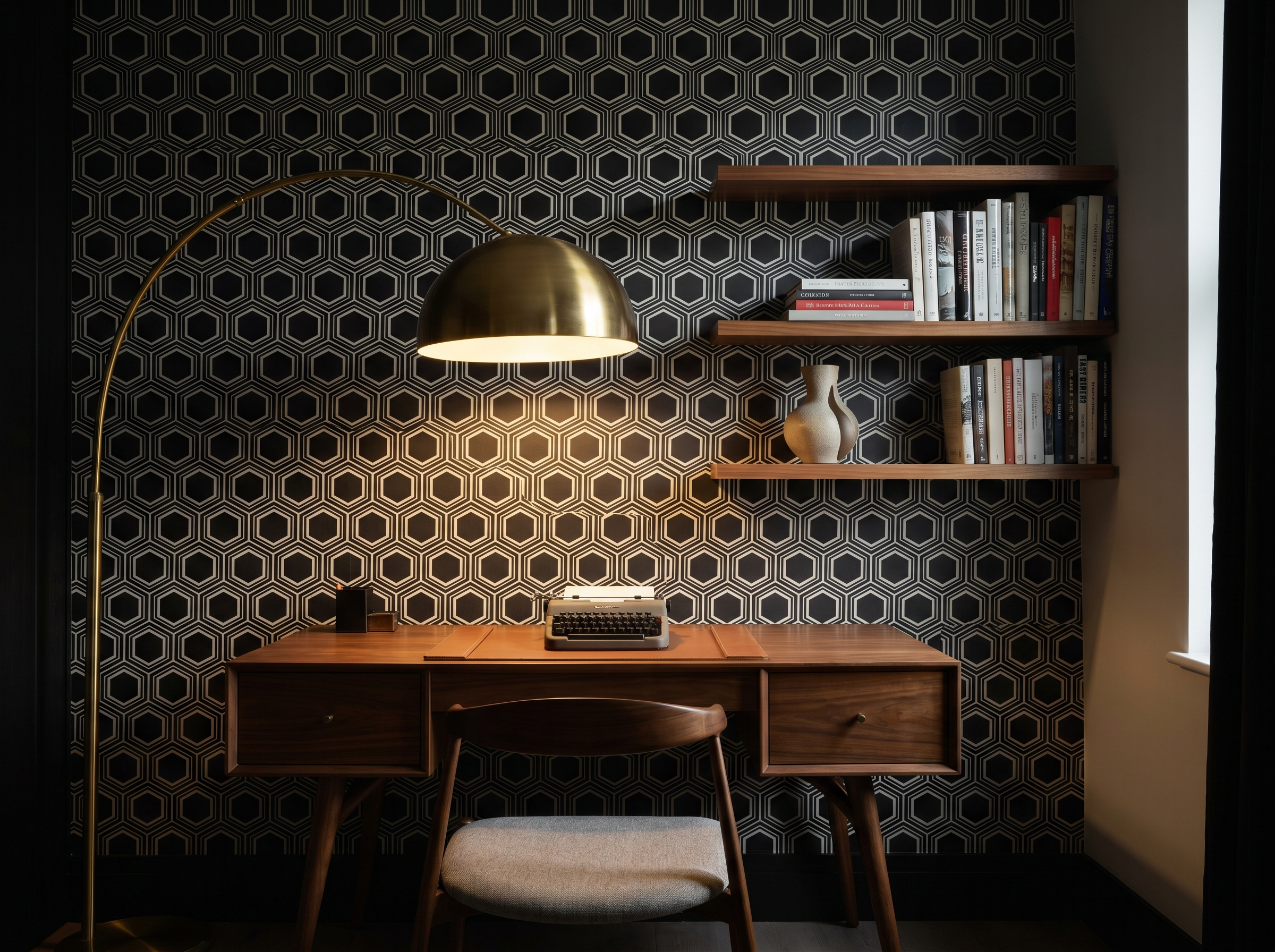
24 Apr 2026 · 5 min read
10 accent wall ideas that interior designers actually approve of
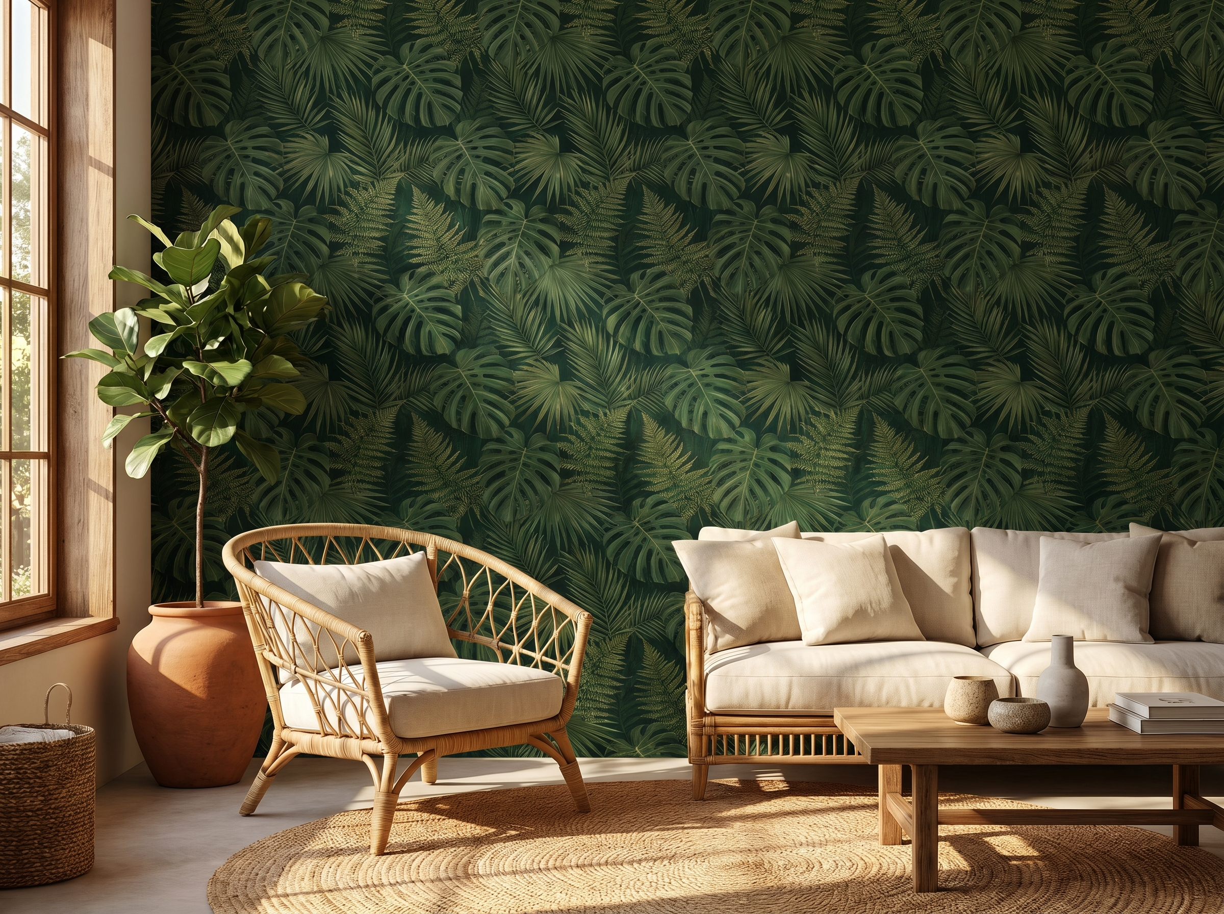
18 September 2026 · 8 min read
Living Room Wallpaper Ideas: 12 Looks That Interior Designers Actually Recommend
2 October 2026 · 8 min read
Bedroom Wallpaper Ideas: 10 Designer-Approved Looks for Every Style
Never miss a story