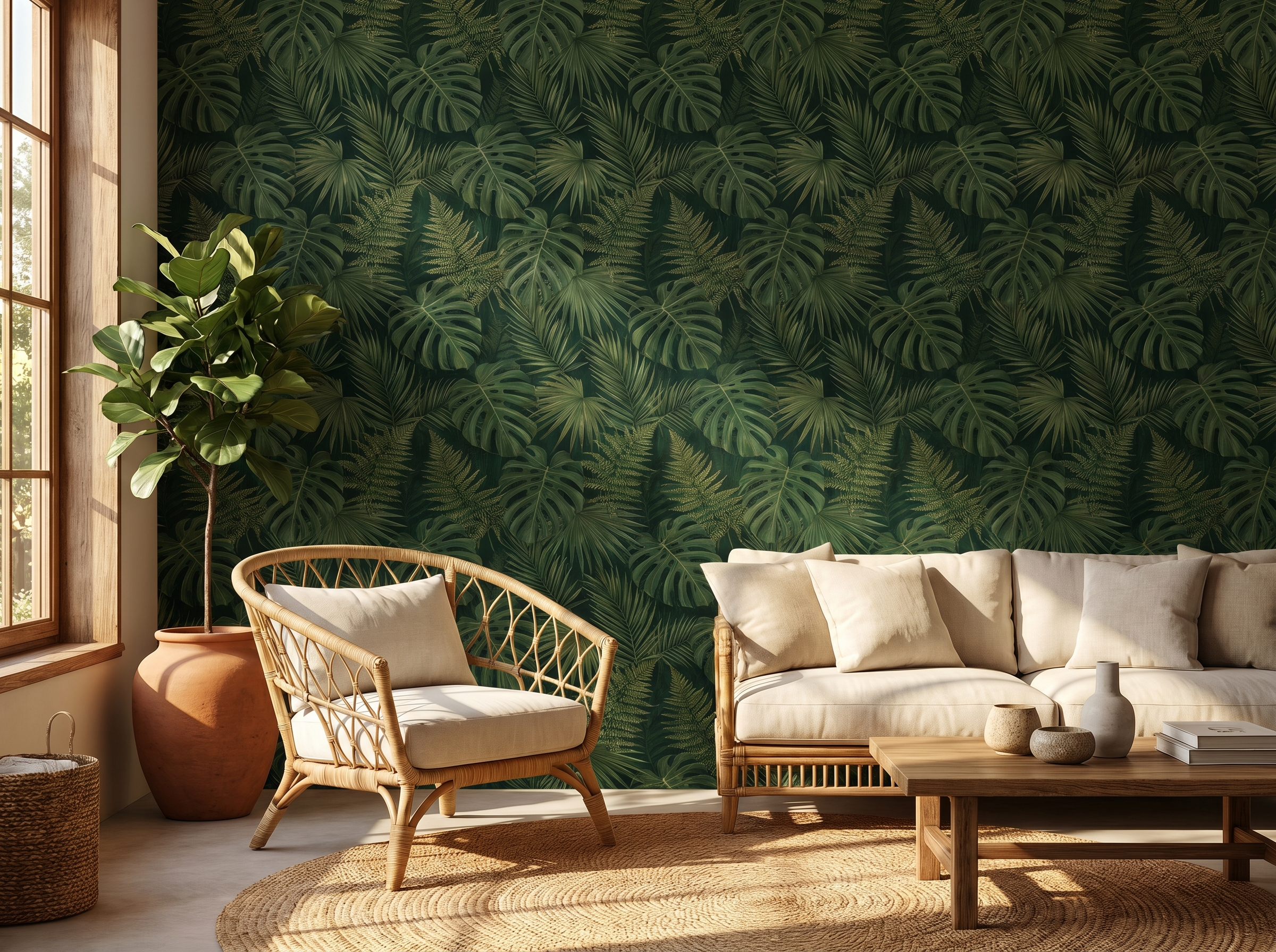
Floral Wallpaper Ideas: 11 Ways to Use the Most Enduring Pattern in Interiors
Florals are the only wallpaper pattern that has never been out of fashion — because they were never fully in it. Here are 11 ways to use them, from the barely-there ditsy to the floor-to-ceiling maximalist.
Florals are the only wallpaper pattern that has never genuinely gone out of fashion. Geometrics come and go. Stripes cycle through decades of favour and disfavour. Maximalism rises and retreats. Florals remain — present in every era, in every country, in every style register from the austerely traditional to the aggressively contemporary. The reason is not sentiment. It is that flowers, as a subject, operate at every scale and in every mood: tiny ditsy prints barely register as pattern; oversized botanical murals transform a room into an environment. The range is wider than any other wallpaper category.
Here are eleven ways to use floral wallpaper, arranged from the quietest to the most committed.
1. The micro ditsy
A small, all-over floral on a plain ground — tiny flowers spaced evenly across a cream or stone background — is the least assertive way to introduce pattern into a room. From across the room it reads as texture rather than print. Up close it reveals detail. These papers are the most versatile florals: they work in almost any room, alongside almost any furniture, and in almost any colour combination. They are also the safest choice for rooms that will be photographed or shown to buyers, because they read as considered without being polarising.
2. The watercolour botanical
Loose, painterly florals — the kind that look like they were rendered in watercolour or gouache and scanned at high resolution — have been one of the defining wallpaper aesthetics of the past decade. The appeal is the apparent spontaneity of the mark: individual flowers that look hand-placed rather than mechanically repeated. The best versions vary the scale and density of the motifs across the repeat, so the eye never quite settles into the rhythm. Brands like Cole & Son and Graham & Brown produce strong examples; Rifle Paper Co built an entire business on this aesthetic.
3. The dark-ground floral
White or cream flowers on a deep background — navy, forest green, charcoal, burgundy, black — is one of the most striking of all wallpaper formats. The dark ground eliminates the pastels-and-prettiness association that puts some people off florals; the result reads as dramatic rather than decorative. In a dining room or bedroom it is exceptional under lamplight, where the dark background recedes and the pale flowers seem to float. This is the floral for people who think they don't like florals.
"The dark-ground floral is the most reliable way to make a traditionally feminine pattern feel completely gender-neutral."
4. The oversized maximalist
William Morris established the template in the 1870s: large, dense, interlocking floral compositions with multiple layers of stems, leaves, and blooms, covering the entire wall surface. This style reached its peak cultural saturation in the 1970s and has been selectively revived in each decade since. The contemporary version retains the density but often shifts the palette — away from the original ochres and rusts toward darker, more saturated combinations. It is the most demanding of all floral wallpapers to live with and, used correctly, the most magnificent. Limit it to rooms that can support the weight: high ceilings, period architecture, strong furniture.
5. The tonal floral
A tonal floral uses a single colour family throughout — pale blue flowers on a slightly darker blue ground, or cream flowers on an ivory background. From a distance it reads as almost plain; up close it reveals the floral structure. These papers are among the most sophisticated in the floral category because they work through restraint: the pattern is present but never insistent. They are the easiest florals to combine with other patterned soft furnishings because they don't compete for attention.
6. Heritage chintz
Chintz — glazed cotton printed with large, sprawling florals, originating in Indian textile trade and absorbed into British interior tradition in the 18th century — had a long period of cultural unfashionability following its saturation peak in the 1980s. It is back, and this time worn with more self-awareness. The contemporary interpretation of chintz wallpaper keeps the generous scale and the characteristic colour range (coral, sage, powder blue, warm cream) but uses it in rooms with more modern furniture: a chintz wallpaper in a room with a linen sofa and bare floorboards reads very differently from the same paper in a room full of frilled lampshades. The setting determines whether it reads as nostalgic or knowing.
7. The Japanese-influenced floral
Cherry blossom, peony, and chrysanthemum prints informed by Japanese woodblock tradition have a distinct visual quality: the flowers are stylised rather than naturalistic, the compositions are asymmetric, and there is deliberate negative space that Western floral traditions typically avoid. These papers pair well with contemporary and Japandi-influenced interiors — light wood furniture, washi paper lampshades, natural fibre rugs — and avoid the traditional-English connotations of chintz or Morris. They work particularly well in bedrooms and bathrooms where the considered use of space is part of the aesthetic.
8. The contemporary graphic floral
Flat-colour florals with a graphic, almost printed quality — the kind that looks like a designer deliberately stripped out the shading and rendered each petal in a solid block of colour — occupy a distinct position between illustration and abstraction. They are unmistakably florals but carry none of the traditional associations. Strong with mid-century modern and Scandinavian-influenced furniture. The Swedish brand Boråstapeter produces some of the most refined versions; the pattern language sits somewhere between botanical illustration and graphic design.
9. The Gustavian or Swedish pastoral
Faded, elegant, and almost deliberately worn-looking, the Gustavian floral references the Swedish court style of the late 18th century: small, scattered flower motifs in the palest of palettes (dusty rose, silvery blue, warm grey) on a near-white ground. These papers create rooms of great quietness and refinement. They are the most forgiving florals to live with over a long period because the palette barely registers as colour. In a bedroom with bleached wood floors and white linen they are exceptional; in a warm south-facing room with strong light they look luminous.
10. The bedroom rose
The rose remains the defining floral wallpaper motif. Not the tight, stylised roses of a 1980s bathroom border, but the generous, open, slightly over-blown rose of a garden at its peak. The most successful contemporary rose papers present the flower at scale — large enough that each bloom commands attention — in either a light-on-dark or a naturalistic illustration format. Used behind a bed it creates an environment that is romantic without being precious. Pale pink or dusky rose on cream is the most classic combination; deep red or burgundy on dark green is the most dramatic.
11. Floor-to-ceiling in a small room
The interior design orthodoxy says small rooms need small patterns and pale colours. In the case of florals, this is wrong. A small room — a cloakroom, a box room, a tight hallway — papered floor-to-ceiling in a large, confident floral does something that a pale small-print paper cannot: it creates a sense of deliberate intention. The room becomes a box of wallpaper, and the wallpaper becomes the room. The small scale limits how much of the paper is visible at any moment, which actually reduces the chance of the pattern feeling overwhelming. Some of the most celebrated wallpapered rooms in British interiors are small.
Styling around a floral wallpaper
The most common mistake when styling around a floral wallpaper is treating everything else in the room as a neutral backdrop. A large floral paper needs to be met with substance: furniture with presence, textiles with weight, objects with character. Rooms where the wallpaper is the only designed element look unfinished.
The practical rule: pull one or two specific colours from the paper and use them in the room's soft furnishings and accessories. Not all of the colours in the paper — select the background tone and one accent. A navy-ground botanical: navy cushion covers, brass or aged-bronze metal. A pale sage floral: terracotta or rust accessories, warm wood tones. The colours that already exist in the paper are the colours the room wants.
Pro tip: Pattern mixing with florals — Florals pair best with geometric or textural patterns rather than other florals. A floral wallpaper with a plain-weave linen sofa, a striped cushion, and a geometric rug is a considered room. Two different florals in the same space require exceptional skill to work and usually don't. If you want pattern elsewhere, choose a different category.
Explore our floral wallpaper collection
From barely-there ditsy prints to floor-to-ceiling maximalist botanicals — browse the full range and order samples before you commit.
Shop floral wallpaper →Sofia Laurent
Sofia is a Paris-based interiors writer and contributing editor at Murall Journal. She covers trend, design culture, and the spaces that shape us.
Continue reading
19 May 2026 · 4 min read
Why botanical wallpaper is the defining interior trend of 2026
2 October 2026 · 8 min read
Bedroom Wallpaper Ideas: 10 Designer-Approved Looks for Every Style
18 September 2026 · 8 min read
Living Room Wallpaper Ideas: 12 Looks That Interior Designers Actually Recommend
Never miss a story