Wallpaper Trends 2026: The 10 Directions Defining Interiors Right Now
From the sustained dominance of dark botanicals to the unexpected return of the dado rail, here is what is actually selling, what designers are specifying, and what is quietly fading out — based on what we are seeing across the market in 2026.
Wallpaper trends move more slowly than fashion trends, and that is part of their appeal. A paper hung in 2023 does not need to be replaced in 2026. But understanding what is current matters for two reasons: it tells you which directions have market momentum — and therefore wider product ranges, more design variation, and better value — and it tells you which directions are fading, so you do not invest in something that will feel dated before the paste has fully cured.
What follows is not a mood board exercise. It is a genuine read of where the market is in 2026, based on what is selling, what designers are specifying, and where the most interesting new work is appearing.
10 wallpaper trends defining 2026
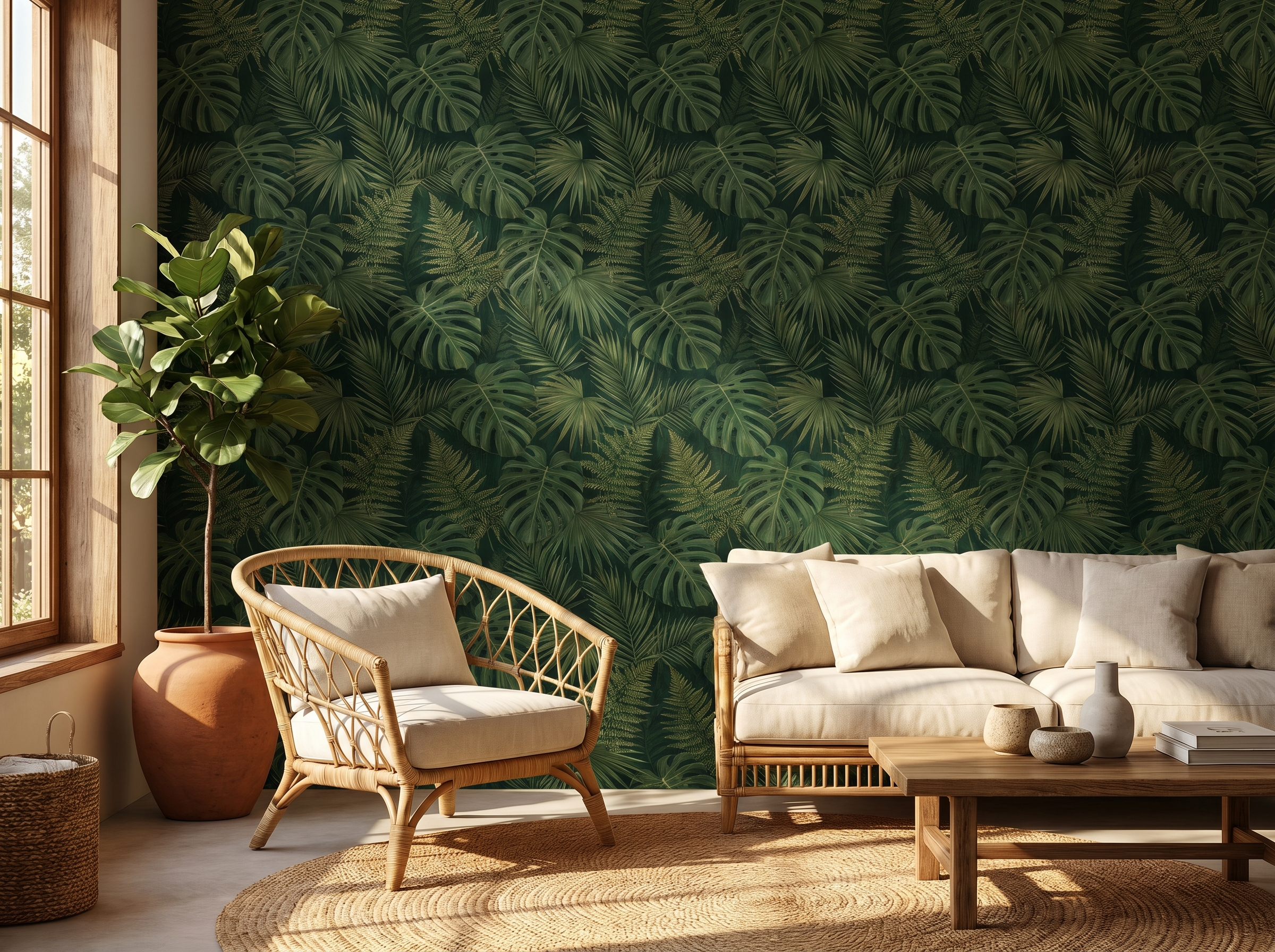
1. Dark botanicals — still the dominant force
Dark-background botanical wallpaper has been the defining residential wallpaper trend since 2022, and in 2026 it shows no sign of declining. If anything, the category is maturing: the designs are becoming more sophisticated, the colour palette is broadening beyond forest green into deep teal, charcoal-brown, plum, and warm near-black, and the botanical references are becoming more specific — named species, scientific illustration quality, herbarium-adjacent precision.
The reason for the trend's longevity is structural: dark botanicals solve a problem that many homeowners have with contemporary interiors. They add warmth and intimacy to rooms that have been stripped of the textiles and object density of older decorating styles. They are complex enough to reward attention without requiring constant visual work. They age well. The trend will not die; it will evolve.
"The dark botanical is no longer a trend — it has become a permanent category, like stripe or geometric. The question is no longer 'is this trend over?' but 'which botanical is right for this room?'"
2. The maximalist chinoiserie revival
Chinoiserie — the European fantasia of Chinese decorative arts, with its pagodas, exotic birds, and flowering branches — has been in the background of interiors for 300 years. What is new in 2026 is the scale and the colourway: modern chinoiserie is going bigger, darker, and more graphic. The pale blue-on-cream of the traditional drawing room is giving way to deep jade-on-black, vermillion-on-navy, and gilt-on-charcoal. The design language is the same; the register is entirely different.
This shift makes chinoiserie work in contemporary and even industrial spaces where the pale traditional version would look incongruous. It is appearing in dining rooms, bedroom head walls, and in cloakrooms and bathrooms as an all-walls statement.
3. The mural moment — full-wall narrative
The full-wall mural has moved from hospitality and retail into residential interiors in a way that feels genuinely permanent rather than transitional. The technical reasons are clear: digital printing quality has improved dramatically, custom sizing to the millimetre is standard, and the price gap between a premium patterned paper and a premium mural has narrowed to the point where the mural is no longer a luxury compromise.
The design directions within murals are themselves trending in a specific way in 2026: away from literal landscape photography (which has dated quickly) and toward painterly, illustrative, and abstract compositions — murals that feel drawn or painted rather than photographed. Misty forests, tonal washes of colour suggesting landscape, loose botanical panoramas. The mural as art rather than document.
4. Natural textures — grasscloth, linen, sisal
The pendulum swing away from high-contrast printed pattern that characterised the 2015–2020 period has not resolved into minimalism — it has resolved into texture. Grasscloth, linen-textured vinyl, sisal-effect papers, cork-face papers: materials that give a wall depth and warmth without a visible design. These papers read as interior architecture rather than decoration, which is precisely why they suit the current moment: they let the furniture, lighting, and objects in a room do more work.
The 2026 development is the colour range. Natural texture papers in white and off-white have been available for years. The current market expansion is in coloured grasscloth and linen papers — deep rust, sage, warm stone, dusty blue — that combine textural warmth with a colour statement.
5. Tonal geometrics — the high-contrast retreat
High-contrast geometric wallpaper — black-and-white hexagons, stark chevron, crisp monochrome diamonds — peaked in the mid-2010s and is now in visible decline. What has replaced it is not the absence of geometric but the tonal version: geometrics where the two colours are close values of the same family, creating pattern through texture and shadow rather than colour contrast. Charcoal on dark grey. Warm white on cream. Deep forest on olive.
These papers work in precisely the contexts where high-contrast geometric struggled: living rooms, bedrooms, spaces where you spend extended time and need the wall to recede rather than advance. They are harder to photograph well, which is partly why they were slower to gain traction in the Instagram era — but they are among the best rooms to actually be in.
6. Deep forest green — the colour defining the decade
If you had to name one colour that defines 2020s interior design, it would be deep forest green. Not the bright kelly green of earlier decades, not the grey-green of the 2010s — but a saturated, dark, botanically-grounded green that relates to foliage in low light. It has appeared in paint, upholstery, cabinetry, and tile, but it is in wallpaper that it looks most natural: the complexity of a dark botanical in forest green is greater than any flat painted surface can achieve.
The 2026 evolution of this colour direction is the introduction of foils and partners: deep teal (which reads as green in some lights, blue in others), warm near-black with green undertones, and botanical compositions that include multiple greens across the tonal range from near-white to near-black. The colour is not going anywhere — it is becoming more sophisticated.
7. Peel-and-stick goes premium — the quality gap closes
As recently as 2020, there was a visible quality gap between peel-and-stick and paste-the-wall wallpaper. The adhesive was less reliable, the print fidelity was lower, and the material felt plasticky at close range. In 2026, the gap has effectively closed at the premium end. The best peel-and-stick papers — from Chasing Paper, Tempaper, and Hygge & West — are now indistinguishable from paste papers in photographs and at normal viewing distances. Adhesion on properly prepared walls is reliable for 7–10 years.
The consequence is a significant shift in who is buying wallpaper. The renter market, previously excluded from paste wallpaper by tenancy agreements, is now a full participant. Younger buyers who move frequently are choosing peel-and-stick not as a compromise but as the strategically correct choice for their situation. This is expanding the market for wallpaper overall rather than cannibalising paste paper sales.
8. The dado rail comeback — architectural wallpaper treatments
After two decades in which the prevailing instinct was to remove Victorian and Georgian architectural features and maximise plain painted wall area, there is a strong counter-movement in 2026. Dado rails, picture rails, and panel mouldings are being reinstated — or simulated in wallpaper — and the two-height treatment (different paper or colour above and below the dado) is appearing regularly in editorial and increasingly in residential projects.
The wallpaper industry has responded with papers that simulate panelling, wainscoting, and dado treatments without any joinery. Applied below a picture rail, these papers create a period-appropriate architectural effect in an afternoon. The trend reflects a broader cultural revaluation of craft, detail, and the pre-modernist interior — a reaction to decades of the blank white wall as the default setting.
9. Abstract painterly — the hand-made mark
Across all applied design in 2026, there is a premium on visible human process: the brushstroke, the print registration imperfection, the deliberately uneven repeat. In wallpaper this manifests as abstract painterly designs — loose watercolour washes, gestural mark-making at scale, botanical interpretations that feel drawn rather than designed. The repeat is either very long (so it is not easily detected) or deliberately irregular (so the imperfection is the point).
These papers appeal to buyers who want warmth and individuality but are not ready for a bold botanical or a pattern with an identifiable motif. They are among the most successful papers in living rooms and bedrooms precisely because the abstraction is restful — the eye moves across the surface without resolution, which is relaxing rather than demanding.
10. Quiet luxury — texture without pattern
'Quiet luxury' as a cultural concept peaked in fashion around 2023 but its interior design expression is still gaining ground. In wallpaper terms it means: no visible pattern, no colour statement, maximum material quality. Papers that look, at a glance, like beautifully painted walls but on closer inspection reveal a woven linen texture, a subtle embossed geometric, a silk-effect sheen that shifts under different light sources. The sophistication is in the material rather than the design.
These papers are predominantly used in dining rooms, primary bedrooms, and home offices — rooms where the occupant wants to signal quality without decoration. They are expensive relative to their apparent visual complexity, which is exactly the point. The price is the statement.
What is fading
Being clear about what is declining is as useful as knowing what is rising. Avoid investing in these directions in 2026 unless you have a specific reason:
- High-contrast black-and-white geometric: peaked mid-2010s, now strongly associated with that period. Tonal geometric has replaced it.
- Chevron and herringbone in primary colours: a sub-trend of the geometric peak, now dated quickly.
- Coastal/nautical motifs (anchors, ropes, crabs): had a moment in the early 2020s, now feels theme-park rather than designed.
- Scandi minimal (white wall, thin line illustration): exhausted by overuse. Still works in children's rooms but has lost its design currency in adult spaces.
- Grey as a neutral: the dominant interior colour of the 2010s. The market has moved to warm neutrals — off-whites with yellow or pink undertones, warm stone, cream. Papers with cool grey backgrounds now read as dated in the same way that brown and orange read as the 1970s.
- Photographic landscape wallpaper (literal photography of mountains, forests, cities): high-quality painterly murals have replaced this. The literal photograph now reads as lower-end despite the technology that produces it.
Trend vs. timeless: how to choose
The question of whether to follow a trend depends on how long you expect to live with the decision. A trend at its peak — meaning it has high product availability, wide design variation, and is being specified at every market level from budget to luxury — is actually a reasonable choice for a long-term paper, because the trend's peak typically reflects a genuine design quality rather than a passing novelty. Dark botanicals peaked around 2023–24 and are still the right choice for thousands of rooms.
The papers to avoid on longevity grounds are those tied to a specific cultural moment: a viral colour, a specific pattern tied to a passing aesthetic (mid-century pastiche, coastal kitsch), or a technical novelty that has become ubiquitous and therefore clichéd. These do not age gracefully.
The safest long-term choices remain those that were correct before they were trends: grasscloth, tonal stripe, chinoiserie, quality botanical. These have been correct for decades because they reflect genuine design values — materiality, complexity, narrative — rather than cultural moment.
Browse by trend
Explore our curated edit of 2026's strongest wallpaper directions — from dark botanicals to quiet luxury textures.
Shop new arrivals →Frequently asked questions
Sofia Laurent
Sofia is a Paris-based interiors writer and contributing editor at Murall Journal. She covers trend, design culture, and the spaces that shape us.
Continue reading
19 May 2026 · 4 min read
Why botanical wallpaper is the defining interior trend of 2026
2 October 2026 · 8 min read
Dining Room Wallpaper Ideas: 10 Looks That Make Every Meal Feel Like an Occasion
2 October 2026 · 8 min read
Wallpaper for Dark Rooms: What Actually Works (and What Makes It Worse)
Never miss a story