Home Office Wallpaper Ideas: 10 Ways to Make Your Workspace Actually Work
Most home offices are decorated like an afterthought — beige walls, flat lighting, a chair pushed against whatever space is available. Wallpaper is one of the fastest ways to change that.
The home office is the most under-designed room in most British homes. Since 2020, millions of people have built working spaces in spare bedrooms, alcoves, garage conversions, and kitchen corners — and most of them are decorated exactly as they were before: white walls, inadequate lighting, furniture chosen for storage rather than environment. It is worth fixing. The room where you spend eight hours a day has a measurable effect on how well you work, how quickly you fatigue, and whether you are able to mentally separate work from home at the end of the day.
Wallpaper is the most efficient single intervention in a home office. One wall — the wall your camera points at, or the wall your desk faces — can transform a generic spare room into a space that feels deliberately designed. Here are ten directions that work.
1. The camera wall
If your desk faces away from your primary wall (so that wall appears behind you in video calls), that wall is now a designed backdrop with a professional audience. This has changed how people approach home office wallpaper more than any other single factor. A dark, textured paper — a deep green grasscloth, a charcoal geometric, a rich navy stripe — reads beautifully on camera because texture and contrast resolve well on compressed video. Pale, flat walls are indistinct. A strong wallpapered background makes you look more considered and your environment more professional without any additional effort.
2. Dark and saturated for focus
There is a body of research on colour and cognitive performance that consistently shows: muted, mid-dark environments (forest green, slate blue, deep charcoal) support sustained focus more effectively than bright or white-walled spaces. The bright white office is a modern invention with no strong evidence behind it. Darker, richer wall colours and papers create a visual boundary — the sense that you are in a defined space for a defined purpose — that bright rooms consistently fail to produce. Bottle green, navy, and warm charcoal are the most widely used dark home office tones for this reason.
3. Textured wallpaper for warmth without distraction
Grasscloth, linen-look, and woven-texture papers add warmth to a workspace without providing the visual stimulus that a patterned paper does. If you find patterned wallpapers too engaging to ignore during calls or while thinking, a textured paper is the answer: it reads as rich and designed but doesn't draw the eye in the way that a repeat print does. These papers also absorb sound slightly better than smooth surfaces, which is an underrated benefit in a room used for calls.
"The best home office is one that feels like somewhere you would choose to be — not somewhere you ended up."
4. Geometric for structure
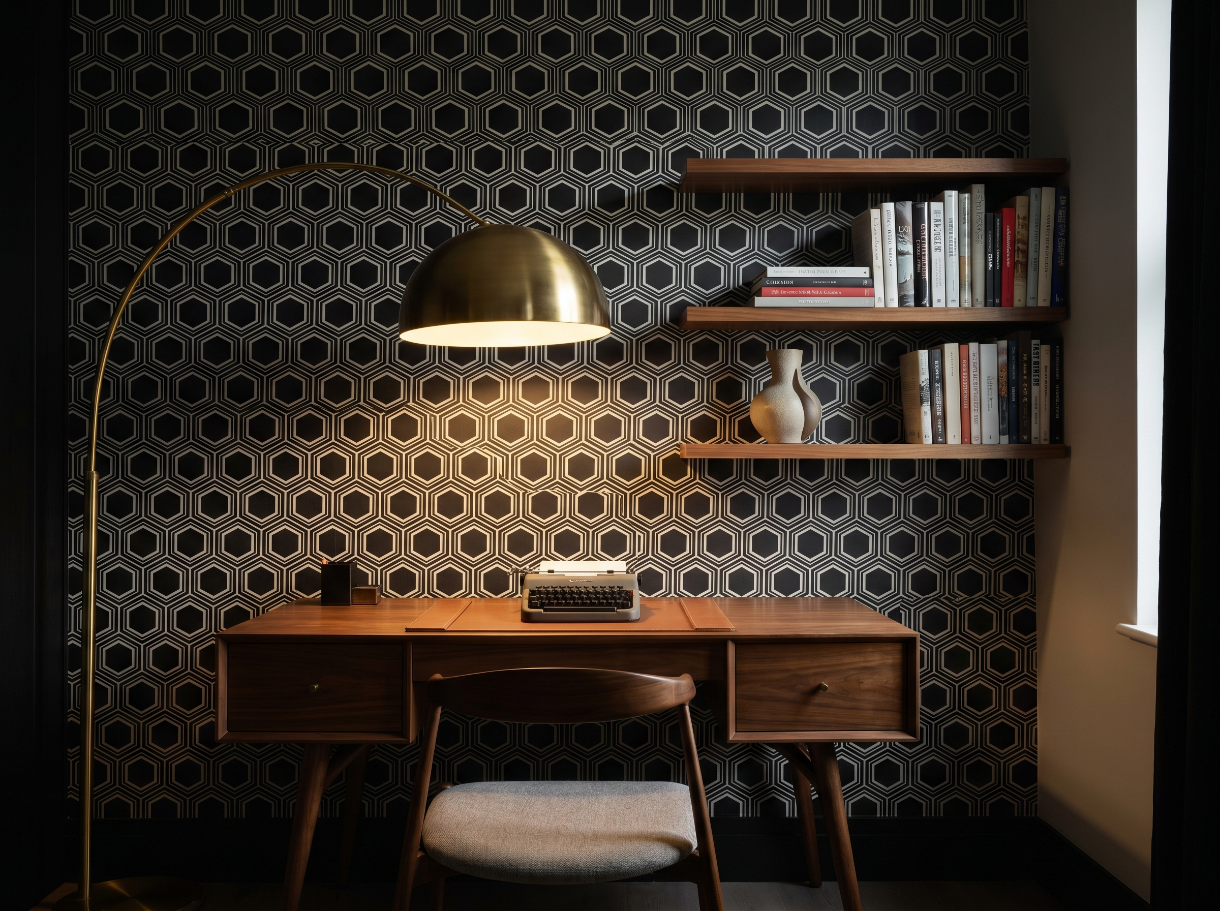
A confident geometric — a diamond lattice, a hexagonal tile pattern, an overlapping arch — suits a working environment because geometry is inherently ordered. It conveys precision and structure without being cold. The key is scale: a small, busy geometric creates visual noise; a large, controlled one adds rhythm without distraction. Black-and-white or two-tone geometrics are the most versatile because they sit easily beside task furniture, shelving, and equipment in multiple colours.
5. Botanical for the focus benefit of nature
Research into biophilic design — designing spaces that maintain a connection with the natural world — consistently shows that exposure to natural imagery, including printed nature, reduces cortisol levels and improves sustained attention compared to pure geometry or abstract pattern. A botanical paper in a home office: fern prints, leaf motifs, forest scenes, or illustrated botanicals. The benefit is not decorative — it is physiological. Choose botanicals with enough detail to register as complex natural imagery rather than simplified cartoon foliage.
6. Tonal stripe for visual rhythm
A wide, vertical stripe — alternating between two tones rather than two colours — adds structure to a wall without competing with whatever is mounted on it (shelving, a clock, a monitor arm). Tonal stripes (charcoal and dark grey; dark sage and forest green; cream and warm stone) are the most versatile because they read as architectural rather than decorative. They are also one of the safest choices on a camera wall because the clean vertical lines create an orderly background that flatters most compositions.
7. An abstract art paper as the single focal point
Large-scale abstract wallpapers — bold brushstroke prints, paint-splash compositions, graphic colour-block designs — work in a home office when treated as the equivalent of a large piece of art: one wall, everything else quiet around it. This is the right choice for creative professionals whose work benefits from an environment that stimulates rather than suppresses. It is the wrong choice for roles requiring extended reading, detailed analysis, or sustained phone calls — the visual complexity is productive for some cognitive tasks and counterproductive for others.
8. The library mural
A full-wall photographic or illustrated mural of a book-lined library has become one of the most recognised home office backdrops. It is effective for a specific reason: it communicates context and expertise in video calls (you are someone who reads, thinks, works with ideas) while also creating an aspirational environment that most people genuinely find motivating. Photowall and Rebel Walls both produce high-resolution versions. The best ones avoid overly realistic photography in favour of illustration or fine-art photography, which reads better in the compressed formats of video calls.
9. The alcove or built-in treatment
If your home office has built-in shelving, a fireplace alcove, or any recessed area around the desk, papering the back of that recess — rather than the whole wall — is one of the most efficient design moves available to you. The shelf contents (books, objects, files) become a curated display against a considered background. The cost is minimal — a single wall section behind shelving typically requires two to three rolls — and the effect is significant. Dark, rich papers work especially well inside alcoves because the recession and the depth of colour reinforce each other.
Pro tip: The desk-faces-wall setup — If your desk faces the wall (so you look at the wall while working, rather than having it behind you), the wallpaper you choose should be one you can be comfortable looking at for hours. Textured neutrals, tonal patterns, and muted botanicals work better than high-contrast geometrics or bright abstracts in this position. The camera wall — behind you — is where the bolder choice belongs.
10. Maximalist for creative professionals
For graphic designers, illustrators, architects, and others whose work involves visual thinking, a maximalist environment — a densely patterned paper, a collision of colours, a rich mural — can actively support the work. The brain accustomed to processing complex visual information is not distracted by a busy wallpaper; it is, for some people, stimulated by it. This is the most personal of all ten approaches: know whether you think better in quiet spaces or rich ones. If you have always decorated your personal spaces with density and pattern, a maximalist home office paper is likely to suit you.
Practical considerations specific to a home office
Lighting matters more in a workspace than in almost any other room. A wallpaper that looks rich and satisfying under warm incandescent light can look flat and draining under a cool overhead LED. Test your shortlisted papers under the actual lighting conditions of the room — at the same time of day you typically work — before committing.
If you use the room for audio recording or podcast production, acoustic performance of the wall surface matters. Textured papers (grasscloth, linen-look) absorb more sound than smooth vinyl papers. Neither is a substitute for proper acoustic treatment, but for light podcast use, a textured wallpaper combined with soft furnishings (rug, curtains, upholstered chair) significantly reduces room reflections.
Video call colour temperature: cameras tend to over-expose pale walls and under-expose very dark ones. The range that reads best on standard laptop cameras and ring-lit setups is mid-dark: deep greens, mid-navy, warm charcoal. Very pale papers and very dark papers both require adjusted camera exposure to look intentional on screen.
What to avoid
Highly reflective or metallic wallpapers on a camera wall will catch light and create distracting glare on video calls. Glossy or foil papers should be limited to walls that are never in the camera frame.
Busy, high-contrast small-pattern repeats — particularly houndstooth and certain checked patterns — create moiré interference in video compression algorithms and will appear to shimmer or distort on screen. If you are on camera regularly, test any small-pattern paper with your camera before hanging.
Find the right paper for your workspace
Browse papers suited to home office environments — from dark saturated textures to graphic geometrics that read well on camera.
Shop home office wallpaper →James Whitfield
James is a London-based design writer who covers materials, interiors, and the spaces where people make things. He has been reporting on the home office since 2020.
Continue reading
2 October 2026 · 8 min read
Feature Wall Ideas: How to Choose the Right Wall and Get It Right
2 October 2026 · 8 min read
Wallpaper for Dark Rooms: What Actually Works (and What Makes It Worse)
18 September 2026 · 8 min read
Living Room Wallpaper Ideas: 12 Looks That Interior Designers Actually Recommend
Never miss a story