Nursery Wallpaper Ideas: Safe, Beautiful, and Built to Last Beyond the Baby Years
The nursery is the most emotionally loaded decorating project most parents take on — and the one where the safety stakes are highest. Here is how to get it right.
The nursery is where most parents make their first serious interior design decision — and where they most often discover how much they care about getting it right. It is also, practically speaking, the room with the strictest constraints: a newborn spends up to eighteen hours a day in it, which makes air quality a genuine concern rather than a marketing point. The good news is that the constraints produce clarity. Safe, beautiful, and built to last beyond the baby phase are not competing objectives. Done thoughtfully, they point in the same direction.
Safety before aesthetics
Wallpaper emits volatile organic compounds (VOCs) during and after installation. In a room occupied by a newborn — whose respiratory system is still developing and who has no means of removing themselves from a poorly ventilated space — VOC levels matter significantly more than in any other room in the house.
Look for wallpaper carrying one or more of the following certifications: Oeko-Tex Standard 100 (tests for harmful substances including formaldehyde, heavy metals, and biocides); FSC or PEFC (responsible forestry chain of custody); EU Ecolabel (environmental performance across the product lifecycle). These certifications do not guarantee a paper has zero emissions, but they impose meaningful limits on the most harmful compounds.
Equally important is the adhesive. Water-based wallpaper paste emits significantly fewer VOCs than solvent-based adhesives. Specify water-based paste explicitly when buying or when briefing a decorator. Allow 48–72 hours of ventilation in the nursery after installation before the room is occupied — ideally with windows open — before bringing the baby in.
Peel-and-stick papers present a particular consideration: the adhesive layer on some self-adhesive papers off-gasses more than traditional paste because it remains active throughout the paper's life. Check that any peel-and-stick paper you choose for a nursery carries an Oeko-Tex or equivalent certification specifically covering the adhesive layer, not just the face material.
The gender-reveal timing problem
Many parents want to decorate the nursery before birth. If the sex of the child is unknown, the instinct to choose a strongly gendered scheme (pink or blue) is understandably set aside. This is actually a design advantage: gender-neutral nursery palettes — warm whites, sage greens, dusty terracottas, soft greys, oatmeal tones — have aged better than strongly gendered ones and work across subsequent children of any sex.
If you do know the sex and want to acknowledge it, the most durable approach is to express the gender through soft furnishings and accessories rather than the wallpaper. A botanical paper in sage and cream reads beautifully with a pink or blue linen crib, with either sex, without committing the walls to a direction you may want to change.
Planning for the room's evolution
A nursery is a nursery for roughly two years. After that it becomes a toddler room, then a young child's room. The wallpaper you choose will either work across those phases or need replacing. The most economical approach is to choose a paper with inherent longevity — one that does not read as specifically babyish at age five — rather than papering twice.
The design directions that survive the transition from nursery to child's room: illustrated woodland and animal motifs that look like art rather than infant graphics; celestial patterns; botanical prints; textural papers; quiet geometrics with soft lines. The directions that tend not to survive: cartoon character themes, bright primary colour schemes, anything that looks like it belongs on a baby gift bag.
10 nursery wallpaper ideas
1. Cloud and sky
Soft white clouds on pale blue or warm white is the most universally beloved nursery choice — and for good reason. It is immediately soothing (the horizontal movement of cloud forms creates a visual rest), it works for any sex, and it reads as gentle without being infantile. The best versions have a slightly illustrated, hand-drawn quality rather than a flat graphic. Children return to cloud wallpaper at age eight or nine with as much affection as they had at eight months.
2. Stars and moons
Stars scattered across a deep navy or soft midnight ground — particularly the kind rendered with a slightly vintage, hand-drawn quality — work from nursery through to mid-childhood. The nocturnal palette aids sleep (dark backgrounds are less visually stimulating than light ones after lights-out) and the star motifs develop new meaning for children as they learn to identify constellations. Choose papers where the stars are the size of small coins rather than large graphics — the finer the detail, the longer the paper survives the child's changing taste.
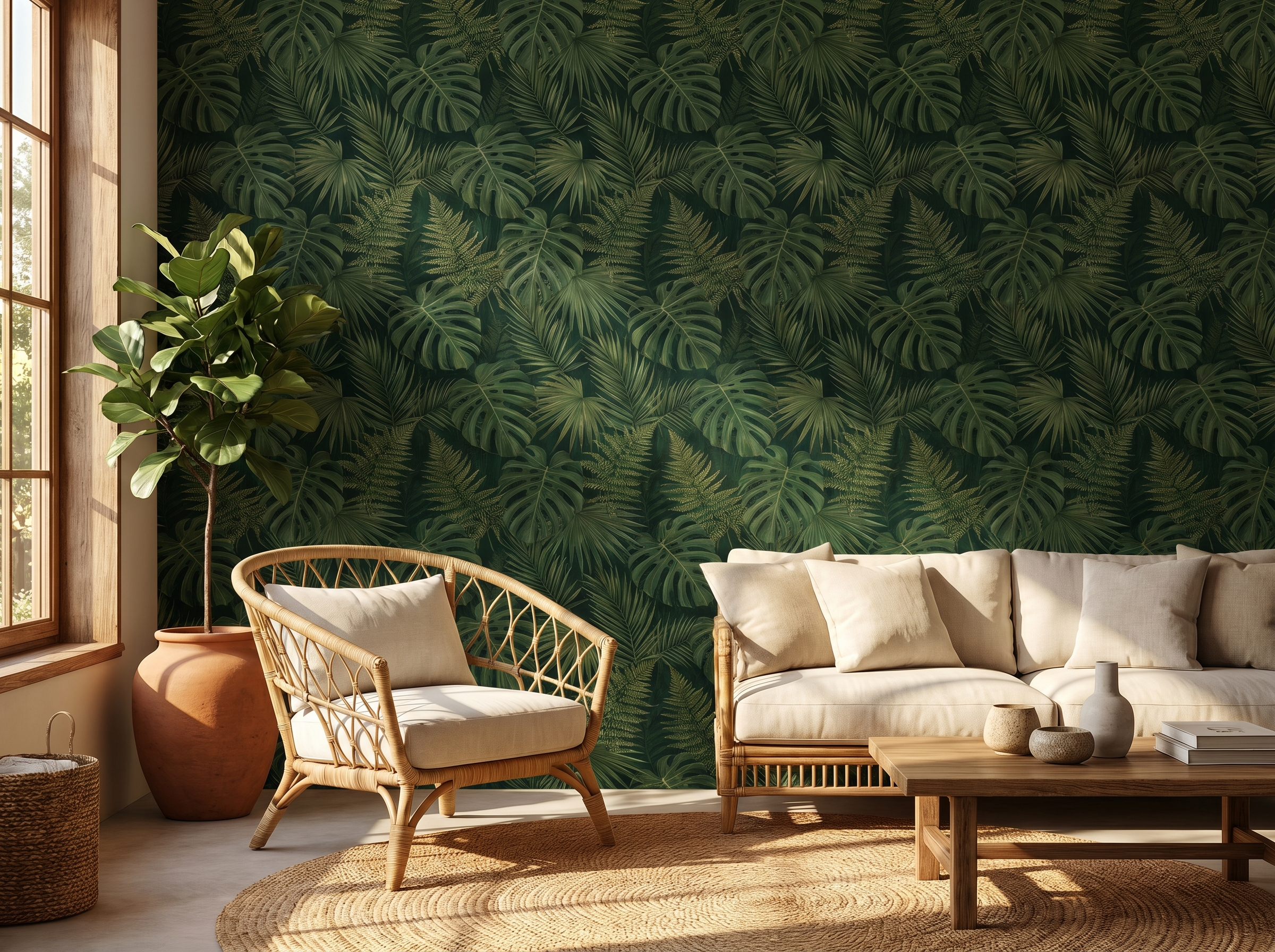
3. Soft botanical or micro-meadow
A paper with small, delicately drawn botanical motifs — tiny wildflowers, individual leaves, small illustrated herbs — reads quietly enough to soothe a newborn while being sufficiently rich in detail to interest a three-year-old. These papers pair with almost any nursery furniture palette (natural wood, painted white, wicker) and are the most straightforward choice for parents who are unsure of the aesthetic they want to commit to.
"The best nursery wallpaper is one that the child grows into rather than out of."
4. A quiet textural paper
A textured wallpaper — linen-look, a fine weave, a subtle emboss — in a warm neutral (oatmeal, warm off-white, pale sage) is the most grown-up choice available to nursery decorators and the most durable. It reads as designed and considered without asserting any specific character. As the child grows and the room fills with colour from toys, books, and soft furnishings, the paper becomes the considered background rather than a competing element. Change the accessories; the paper survives intact.
5. Classic ticking stripe
A fine ticking stripe — the pattern of traditional French mattress ticking — in pale blue on cream or sage on linen has an almost ageless quality. It reads as both traditional and contemporary, works in nurseries and in adult bedrooms, and provides a crisp visual structure that the eye rests on easily. It is the wallpaper equivalent of a well-chosen piece of simple furniture: it disappears usefully into the background and never causes regret.
6. Illustrated woodland animals
Foxes, owls, deer, rabbits, and hedgehogs in an illustrated woodland setting are a perennial choice precisely because the subject matter is appealing at every stage of childhood. The key distinction is between illustrated and graphic: an illustration — drawn with expressive line work, organic imperfection, the kind of detail that rewards close inspection — has a longevity that a flat cartoon graphic simply does not. Scandinavian-influenced illustration styles (soft line, muted palette, natural colouring) age especially well.
7. A soft geometric
An arch, an overlapping circle, a gentle diamond repeat — in soft tones (dusty sage, pale terracotta, warm grey on cream) — is the most design-forward nursery choice and the one that most effectively bridges baby room and child's room without looking transitional in either. These papers look more expensive than they are, work without any specific styling, and carry none of the cultural baggage of animal or celestial themes. If you want the nursery to look like an interior designer has been involved, start here.
8. Watercolour rainbow
A loose watercolour rainbow — particularly one that uses dusty, slightly faded tones (rust, sage, dusty blue, terracotta, ochre) rather than primary colours — is one of the few specifically joyful patterns that also works in a considered adult aesthetic. Paired with natural wood furniture and linen textiles, a dusty watercolour rainbow reads as a design choice rather than a children's decoration. The pattern is legible but soft; stimulating but not overwhelming.
9. A Scandinavian mural
A single wall of a quietly illustrated mural — a snowy forest, a hillside of wildflowers, an abstract nature scene — in the style of Scandinavian children's illustration is the nursery equivalent of the statement piece. It provides an environment rather than a decoration: a world the child can look at during those long hours in the crib, increasingly rich in detail as they develop the focus to see it. Brands like Rebel Walls and Roomblush produce nursery-specific murals that are both beautiful and certified for children's environments.
10. Peel-and-stick for maximum flexibility
If you are not ready to commit to a permanent paper — either because your aesthetic is still forming, because you know the child's interests will determine the room in a couple of years, or because you are in a rented property — a certified peel-and-stick paper is the most sensible choice. It installs in a few hours, removes cleanly, and can be replaced at any point without wall preparation. Limit peel-and-stick in a nursery to papers with Oeko-Tex certification covering the adhesive, and allow 24 hours of ventilation before bringing the baby in.
Colour guidance
The widespread belief that pale pastel colours are most soothing in a nursery is partly true and partly received wisdom. Very pale pink and pale blue are soothing partly because they have low visual contrast. But warm whites, soft greens, dusty terracottas, and warm greys are equally soothing and significantly more durable as the child grows. High-saturation pastels — the kind that appear on most nursery decoration product ranges — age less well than quieter, more muted versions of the same colour family.
Avoid bright primary colours in nursery wallpaper. Red, bright yellow, and saturated orange are visually stimulating and associated with alertness rather than rest — useful in play areas, counterproductive in a room intended for sleep.
Pro tip: The single-wall strategy in a nursery — For parents still unsure of their aesthetic, or who expect to redecorate within two to three years, papering just the wall behind the cot limits both cost and commitment. One wall of a nursery-appropriate paper, with three walls painted in a tone pulled from the paper, gives the room a clear design identity without a full commitment. A standard nursery feature wall (approximately 3m wide × 2.4m high) typically requires 4–5 rolls.
What to avoid
Licensed character wallpaper. The specific character your child becomes obsessed with will change within twelve months. Wallpaper lasts years. Express licensed character enthusiasm through bedding, cushions, and posters — items designed to be replaced.
Papers without safety certification. Any wallpaper installed in a nursery should carry Oeko-Tex Standard 100 certification at minimum. The price difference between certified and uncertified papers is small; the difference in peace of mind is significant.
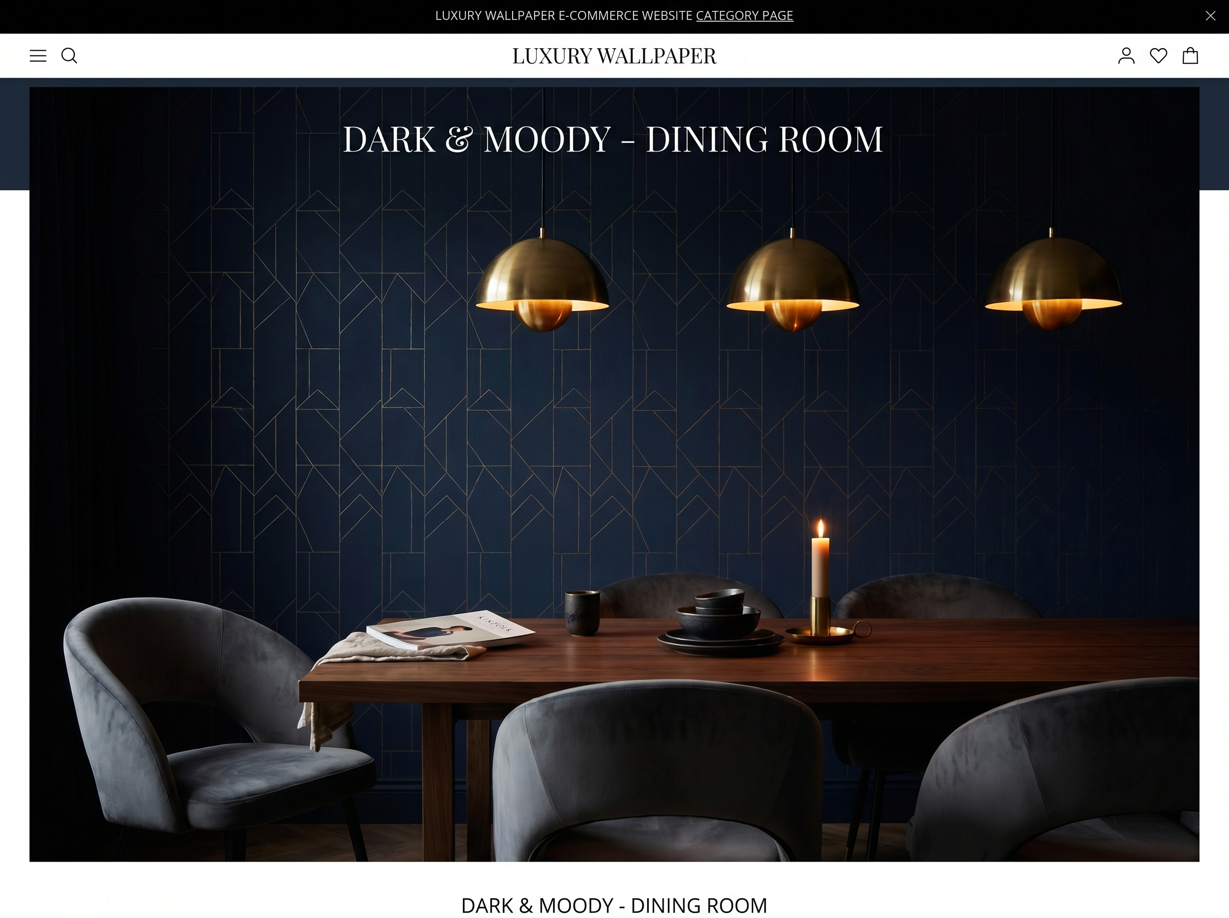
Dark feature walls directly facing the cot. Dark, heavily saturated wallpaper immediately opposite where the baby lies creates high contrast that can interfere with sleep. Reserve dark or bold wallpaper for the wall behind the cot — which is above and behind the baby rather than in their direct sightline.
Find certified wallpaper for your nursery
Browse papers that carry Oeko-Tex or equivalent safety certification — and order a sample before you commit. Living with it in the room for a week is the most reliable way to know you've chosen right.
Browse nursery wallpaper →Sofia Laurent
Sofia is a Paris-based interiors writer and contributing editor at Murall Journal. She covers trend, design culture, and the spaces that shape us.
Never miss a story